
Emma Jameson – 24 November, 2014
‘Crafts' are often neglected or rejected in the realm of the arts for their perceived frivolity and domestic nature. Objectspace's show invests book design with the attention and artful display that it deserves. These books are not simply ‘objects' but are rather living art forms. As each carefully designed page is turned, a new level of narrative meaning is created.
Auckland
Assorted books
Janus Press: The New Zealand Collection
Curated by Kate Shapiro
17 October - 1 November 2014
Cross-cultural and collaborative in nature, the exhibition of the New Zealand Collection of Janus Press books demonstrates the sheer power of the visual to bring alive written prose in the viewer and reader’s imagination.
Appositely timed to mark the first international conference hosted by the Association of Book Crafts New Zealand, Objectspace’s exhibition “Janus Press: The New Zealand Collection” is a strikingly rich and engaging presentation of the personal book collections of Elizabeth Steiner and Beth Serjeant. Both New Zealand bookmakers and print artists, Steiner and Serjeant started collecting the Canadian based Janus Press books after the founder, Claire Van Vliet visited New Zealand for a book symposium in 1993. From that moment on, the three women have been involved in a collaborative relationship fostered on their mutual appreciation of innovative book-art. As well as trading books with each other, Janus Press has also published several books written by New Zealand authors such as Keri Hulme. [1]
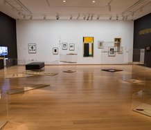
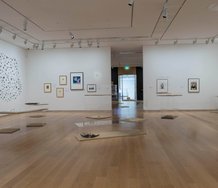
The exhibition at Objectspace was both a celebration and testament to this cross-cultural collaboration. The craft of bookmaking was heralded for its ability to forge transnational ties, allowing for the infiltration of various stylistic and creative influences and techniques.
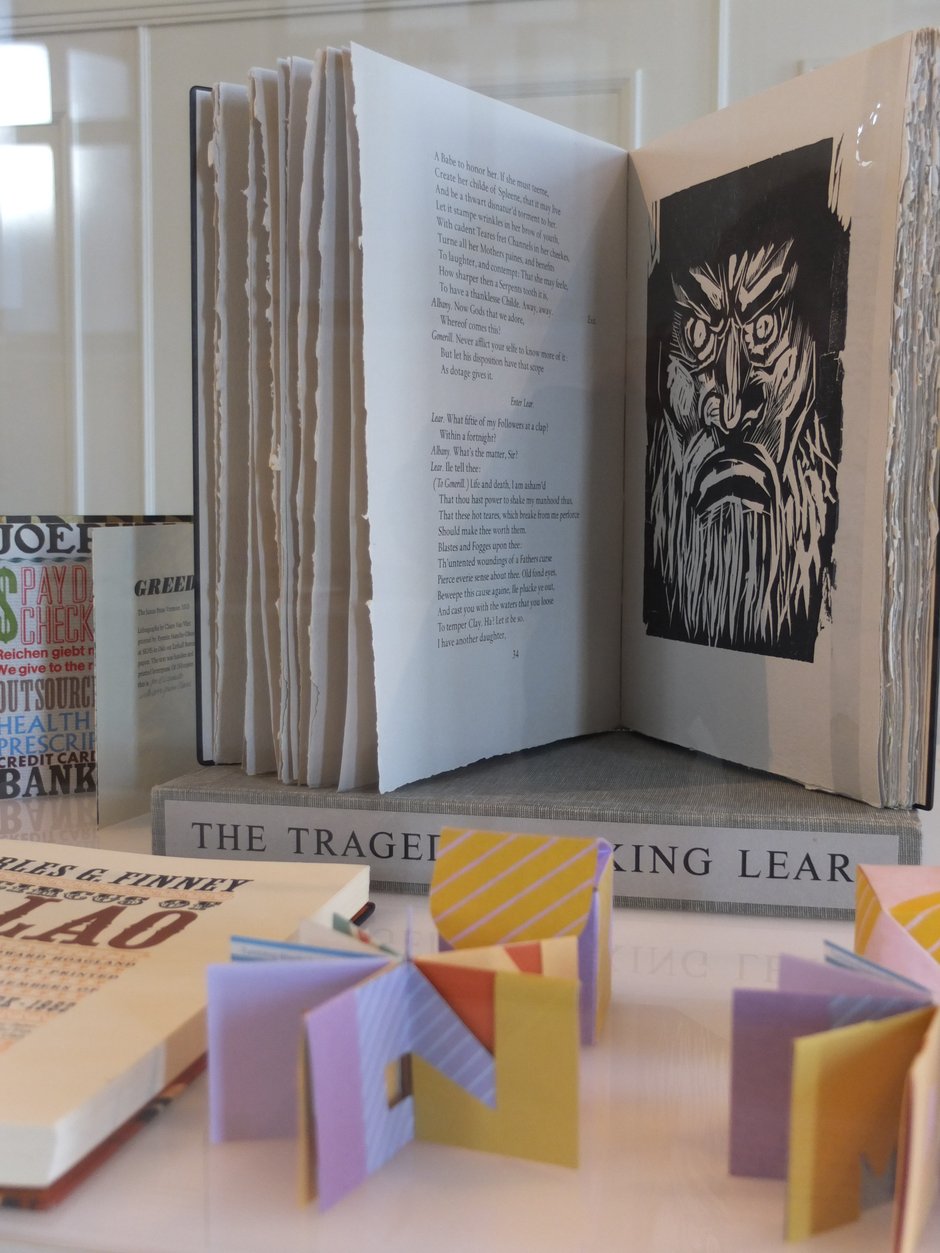
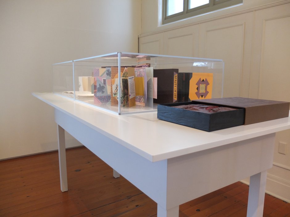
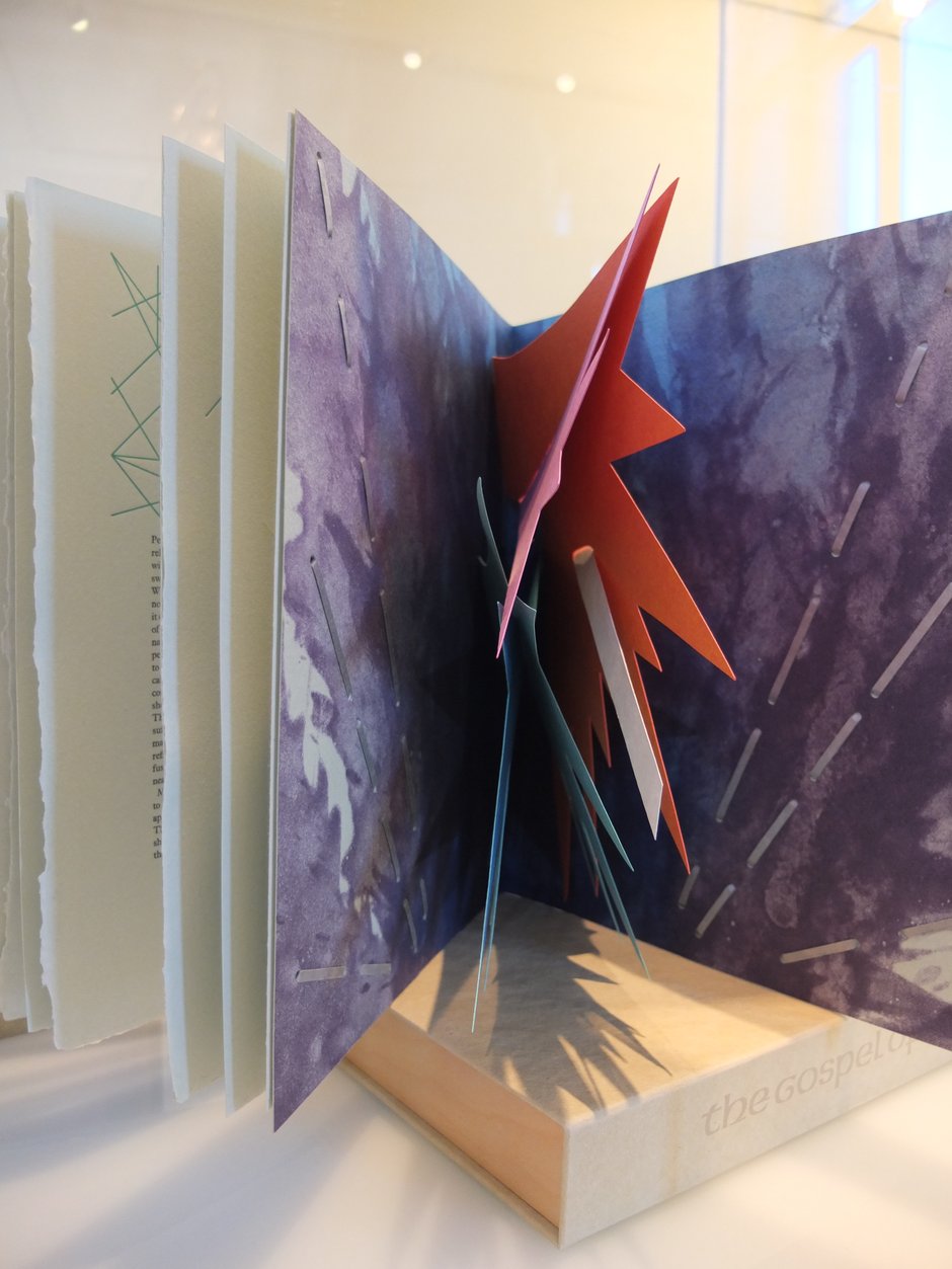
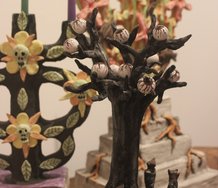
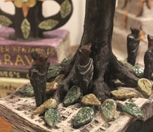
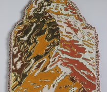
The books on display were strikingly beautiful and engaging in their rich visual and textural variation. Formed in 1955, Janus Press is one of the world’s oldest private press, having printed at least ninety handmade and hand printed books. Yet the age of the firm does not restrictively cement it in tradition, but rather provides a lineage of artistic creation and experimentation that continuously evolves. The Janus Press is notable for the originality of its content and the creativity of its designs, which strive to create a striking physicality that transforms the two-dimensional text into a three dimensional visual experience.
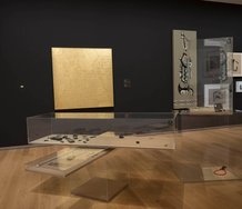
The ability for the medium to substantially contribute to the narrative was particularly evident in “Greed” (2013), which was personally gifted by Van Vliet to Beth and Elizabeth. A scathing indictment against the rise of capitalism since the Reagan administration in the 1980s, the choice of materials and typography in the book empower the words with visual connotations. The word greed is stamped in large, brash writing, its thick black font contrasting sharply against the reflective gold of the front cover. Printed in irregular fonts, this word seems to echo out to the viewer in various (but all equally abrasive) voices. Its dominance in the viewer’s head is powerfully metaphorical for its widespread influence in greater society. Effectively displayed in a zig-zag formation within a glass cabinet, the inner pages of the book corroborate this message. Printed on glossy, machine paper, the book’s design utilises the appearance of capitalism and corporate production as a tool of critique.
This is not a comforting, soft looking handmade book, but is rather impersonal in its hard edges and glossy appearance. The words ‘banker’, ‘hedgefund’, ‘collaterised debt obligation’ scream out in their various fonts. The lithographs, drawn by Van Vliet, provide a raw, personal counterpart to the text. Faces evoked through expressive smudges of black ink blankly stare out at the viewer, bleak in both their expression and also in their monochromatic palette. Originally created in 1973 and then put into storage for 40 years, the publication is a powerful demonstration of Van Vliet’s careful consideration of text, image, and design and how these can converge to communicate complex messages that resonate with the reader. For Van Vliet, a book is not simply an ‘object’, but an organic art project that evolves and is all-encompassing in its inter-sensory approach and result.
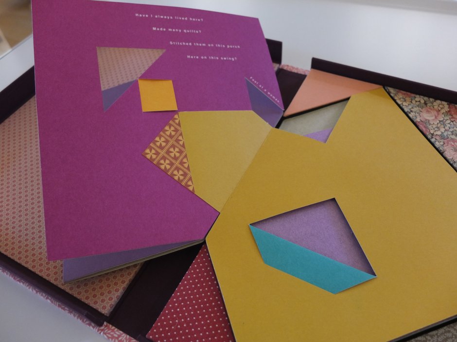
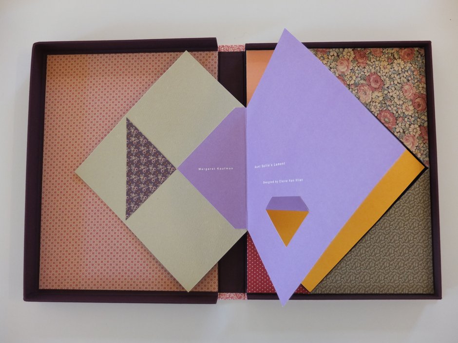
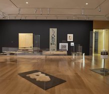
This can similarly be seen in “Aunt Sallie’s Lament altered” (2004), which was a favourite of mine at the exhibition. This book is testament to the ability of objects to change and evolve. They are not static ‘things’ but rather active art forms that can be adapted and re-appropriated to create new sources of inspiration and meaning. Originally a commercial publication about a quilter looking back on her life through poetry, Van Vliet has altered the design of the book to enrich it with dynamic patterns that interweave with each other throughout its pages. By cutting out sections of the book’s pages, patterns from different pages become visible on the one page, creating new textural and optical relationships. The book is almost like a piece of origami craft in its make-up, comprised of complex, interlocking folds of paper. This enriching variation is further created through Van Vliet’s inclusion of extra segments of patterned paper. Although an adaptation of an already existent publication, it has, in Van Vliet’s hands, been transformed into an entirely different object that prompts an original sensory and visual experience.
The layout of the books in zigzagging patterns across various cabinets effectively demonstrates their complexity and variation. Visitors to the gallery were also given the opportunity to look through the publications themselves, elevating the books’ physicality as a central component of the exhibition. This exhibition powerfully demonstrated the skill and importance of crafts like book-making. ‘Crafts’ are often neglected or rejected in the realm of the arts for their perceived frivolity and domestic nature. Objectspace’s show invests book design with the attention and artful display that it deserves. These items are not simply ‘objects’ but are rather living art forms. As each carefully designed page is turned, a new level of narrative meaning is created. It is perhaps for this reason that they have captured the imaginations of people all over the world, forging trans-national ties of shared appreciation of a specialised craft. The strong affection that Beth and Elizabeth have for these books was evident on the opening night. These books seem to have a life of their own in that they interact with each other and the viewer to present new imaginative possibilities.
[1] For more information on the New Zealand connection with Janus Press, see the excellent online brochure produced by Objectspace, written by intern Kate Shapiro.
Emma Jameson is the 2014 EyeContact Artists Alliance Writing Intern, a programme made possible with generous funding from the ASB Community Trust.
 Two Rooms presents a program of residencies and projects
 Advertising in this column
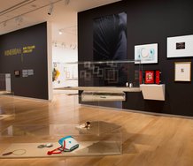

This Discussion has 0 comments.
Comment
Participate
Register to Participate.
Sign in
Sign in to an existing account.