


Andrew Paul Wood – 3 December, 2017
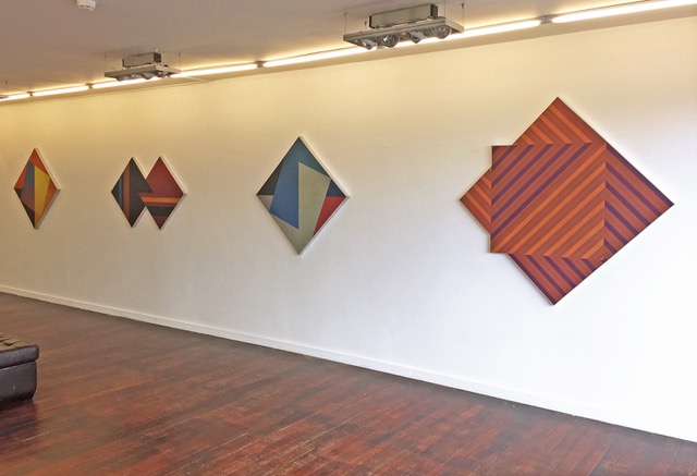
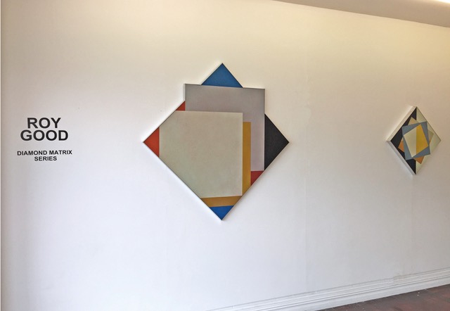
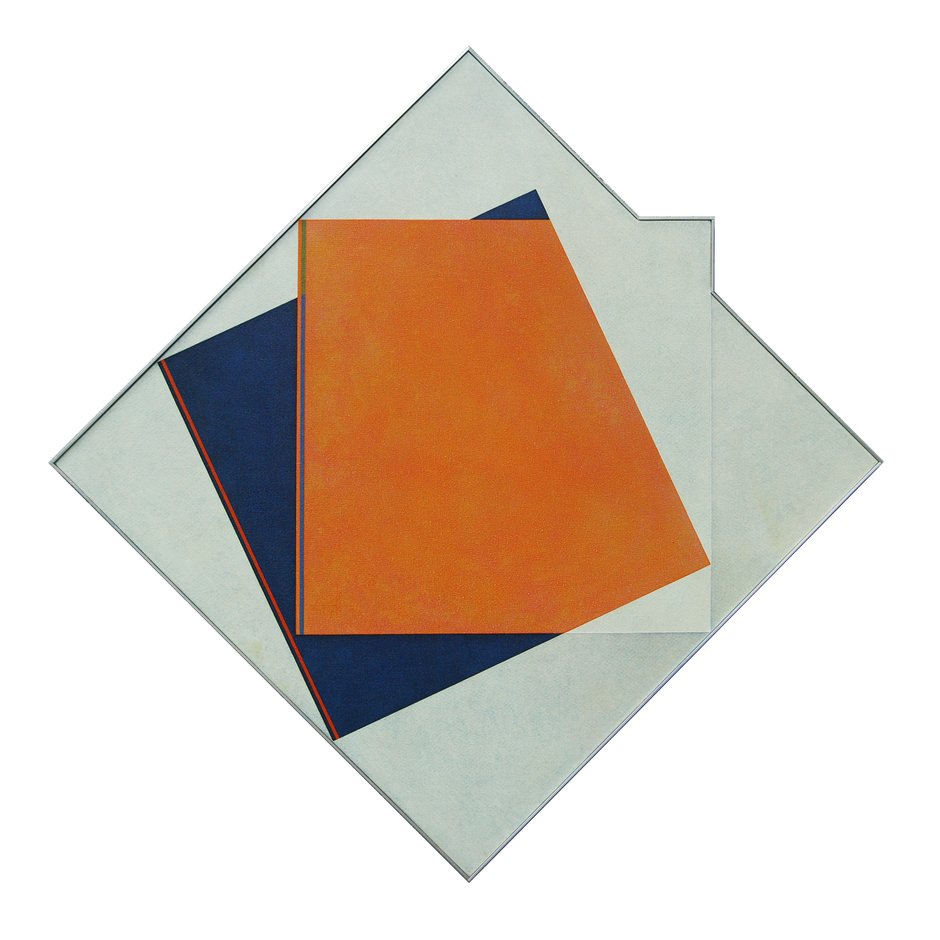
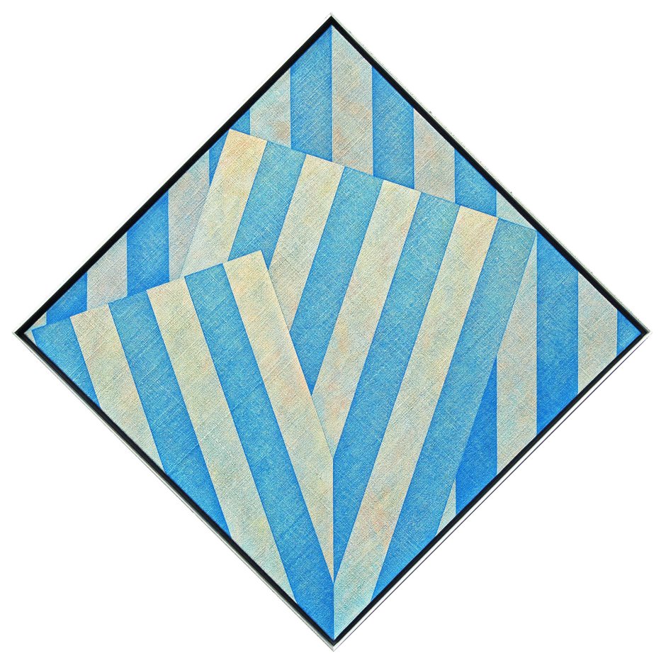
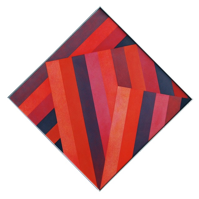
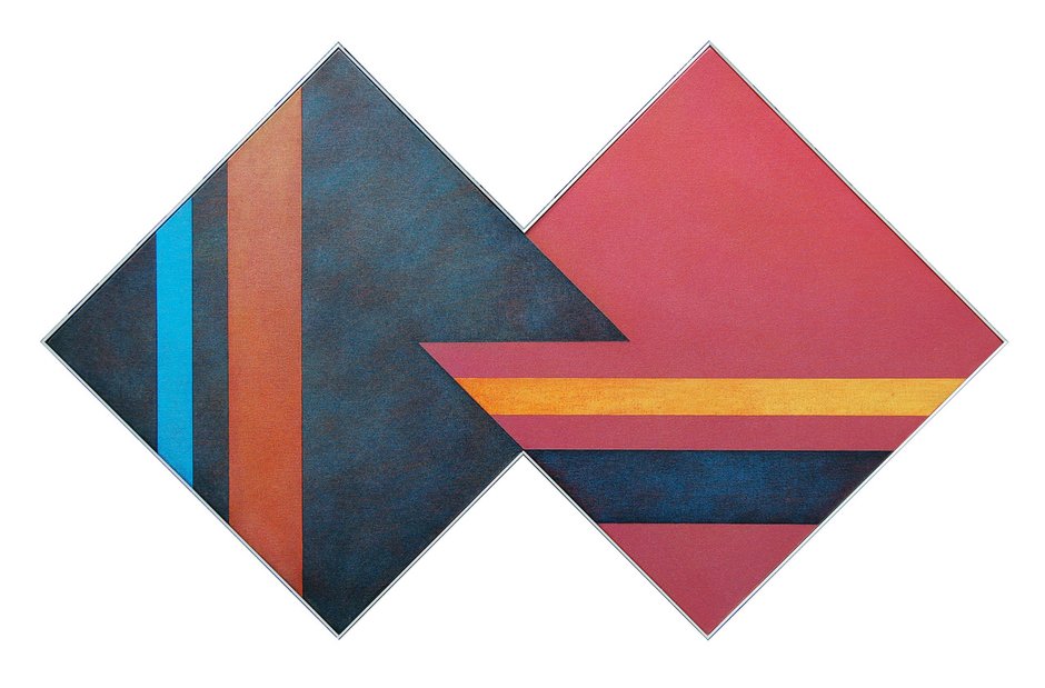
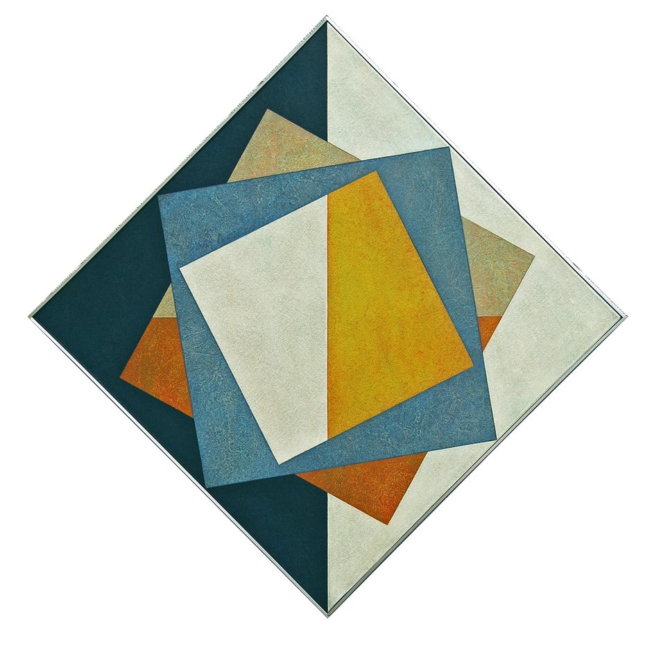
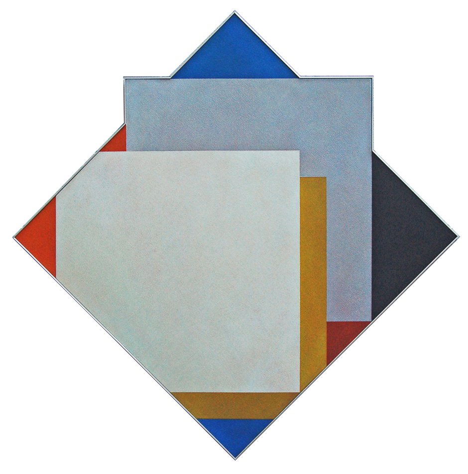
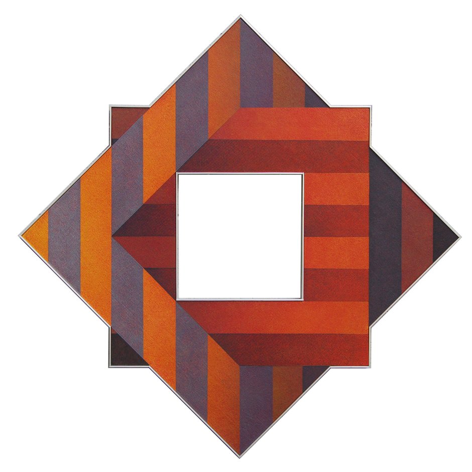
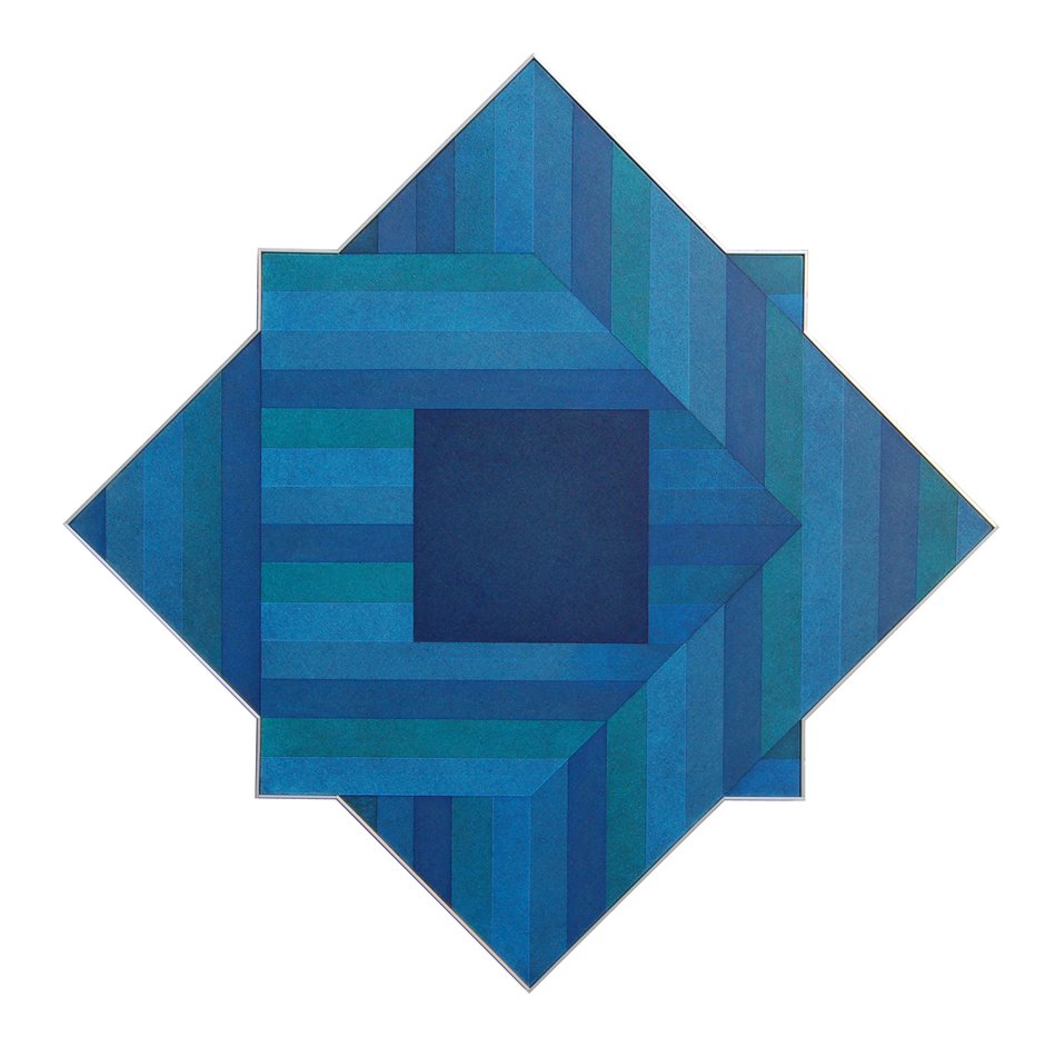
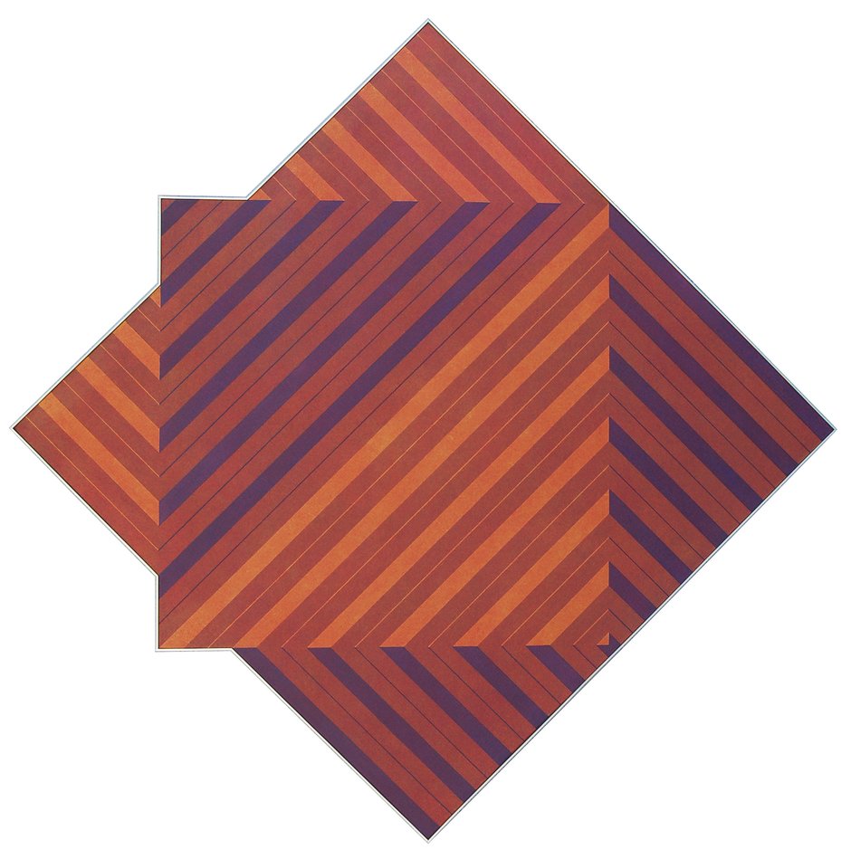
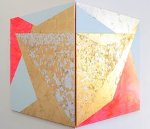
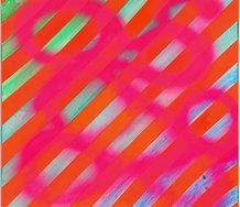
As the title of the show suggests, the works are explorations of the formal compositional possibilities of the lozenge-shaped stretcher, often with complex illusionistic impressions of overlapping squares and lozenges, tilted or rotated, emphasised by the composite shaped canvases. The precise geometries give the work a lot of their impetus and visceral frisson. You can't help but marvel at their adroit interplay, virtuoso inventiveness, and degree of sophistication.
I always enjoy Roy Good’s work. He has remained true to his chosen direction and continues to polish it in pursuit of asymptotic perfection. The continuity between his old and more recent work is always logical and crystal clear, choosing a motif or form and testing its visual balance and stability to the limits of its tolerance. Rarely have I stood before one of his paintings and found anything to be unsatisfied by.
Unsurprisingly, Good’s show of recent work, Roy Good - Diamond Matrix, at Chambers Gallery in Christchurch, is an absolute delight.
Good is an extraordinary fellow. Born in Timaru in 1945, Good went through Ilam in Christchurch in the first half of the 1960s and then to Auckland where the action was, working in design for NZBC TV, later Television One (which became TVNZ in 1980). The history of design for NZ television has yet to be written, but would be wonderful. A diverse bunch have found a niche there:
In Good’s design work you can see something of the way his aesthetic evolved, from the Op Art psychedelica of the sets for C’mon in the 1960s and Happen In in the 1970s for the youth to frug, mashed potato and twist in front of, and the chubby, rounded, minimalist Television One logo with its half rainbow ‘O’ that some of us might remember, from 1975 to 1985. In the 1970s Good, along with Milan Mrkusich, Ian Scott, Geoff Thornley, Phillip O’Sullivan and Gordon Walters, were part of the circle of Auckland art dealer Petar Vuletic. If pressed, one might say that if Walters and Mrkusich were the two poles of a spectrum, Good is about halfway between, Walters’ fussiness and complexity combined with Mrkusich’s sense of colour and texture, though not the latter’s oceanic colour fields.
Vuletic (along with Kees and Tina Hos at New Vision and a few other exceptions) was something of a rarity in New Zealand, a staunch promoter of modernist abstraction at a time when the figurative landscape, or at least, something that tended to look like a landscape when you squinted at it, still held sway, and the Kelliher Prize for landscape was one of the top national art prizes. The year the Kelliher closed, 1977, Good was part of the artist collective that founded DATA gallery, furthering the cause of abstraction.
Good’s paintings wear the influences of American hard edge and colour field abstraction proudly, especially evident in shaped canvases (one of the first artists in New Zealand to do so). At first approach the primary aesthetic is minimalist, geometric and optical, on closer inspection the delicate painterly subtleties of his surfaces reveal themselves, minutely scumbled over with a dry brush rather than muddied, working with the weave of the canvas not unlike Mrkusich. Occasionally there a flaw in the weave causes a tiny excess of pigment to remain, emphasising the tactility of the surface, and the presence of the hand in their otherwise pristine slickness. Think of the ambiguous understatement of Jean-Baptiste-Siméon Chardin’s backgrounds.
As the title of the show suggests, the works are explorations of the formal compositional possibilities of the lozenge-shaped stretcher, often with complex illusionistic impressions of overlapping squares and lozenges, tilted or rotated, emphasised by the composite shaped canvases. The precise geometries give the work a lot of their impetus and visceral frisson. You can’t help but marvel at their adroit interplay, virtuoso inventiveness, and degree of sophistication. Each is a tour de force of intelligence and technique coaxed from the most elemental ingredients.
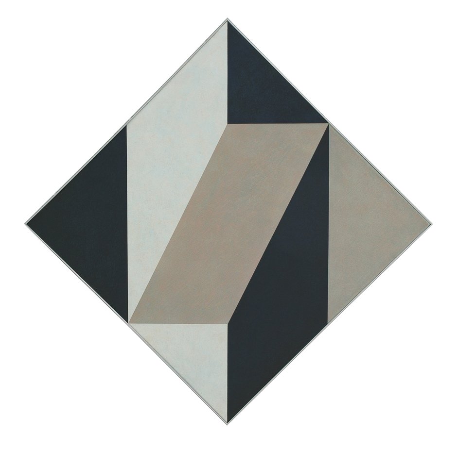
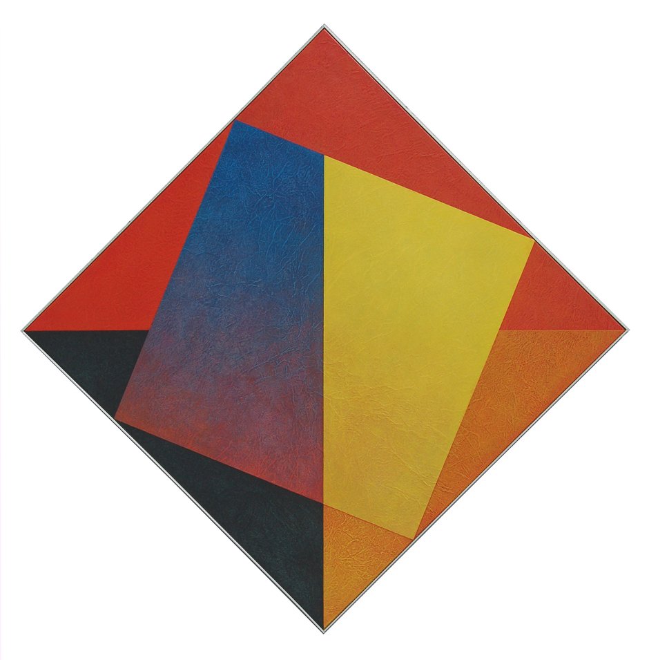
Some of the paintings declare certain art historical allegiances, Diamond Matrix - 4 P.M. for example, is evocative of Mondrian’s lozenge compositions with an impure palette and trompe-l’œil twist; Diamond Matrix - Cleft seems almost like a zoomed-in close-up of a detail from an Albert Gleizes painting; Diamond Matrix - Von Bezold suggests Frank Stella in a daring palette of earth tones and purple (purple, I think, can be an earth tone, because its components otherwise serve up brown), but actually alludes to the Bezold Effect, an optical illusion discovered by German meteorologist Wilhelm von Bezold in the nineteenth century that demonstrated the visual impression of colour changes when adjacent to small areas of colour, as opposed to large areas which merely form a compliment or contrast.
These subtle effects inform much of the delicacy of Good’s work. He is a masterful colourist. Diamond Matrix - Square Rotates is amble evidence of that with its complimentary-yet-dynamic, impure reds, yellows and oranges and bold counterpoint of black, and an impressive Pontormo-esque gradation of red into blue unlike anything else in the show, or familiar to me from other work by Good I’ve seen. Bisecting Planes - Bouquet is an interesting one in terms of palette, its crimsons, vermilions and mixed puces, otherwise reminiscent of the fashionable hues of the late 1970s/early ‘80s, suddenly enlivened by strips of pink and transporting one to thoughts of roses.
Diamond Matrix - Homage to Fredrick, is, I assume, a reference to Fredrick Hammersley, though I tend to think of him more in terms of vivid colour and Good’s painting is in grisaille, and Diamond Matrix - A Tilt to Malevich is exactly what it says on the tin.
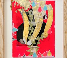
At other times the deftly scumbled surfaces give an almost figurative impression, as in Bisecting Planes - Blue Ascent, which, at least for me, evokes some light and breezy Art Deco scene of beach chairs. At moments like that the graphic designer emerges briefly to say hello. Bisecting Planes - Diamond Tango does that too, making me think of folded beach towels, and that’s not a bad thing at all, it’s a pleasant evocation of innocent joy. That though, is one of the interesting things about abstract art, like music it can conjure all these feelings, impressions and memories out of people, each quite unique to the individual, and each entirely valid in their truth.
Bravo Maestro! Good is Good.
Andrew Paul Wood
Recent Comments
Ralph Paine
It's all as if yesterday Roy. I can even remember the little sign that hung on the cafeteria wall LITTLE ...
Roy Good
Kia ora Ralph, It's been a long time and nice to to know those days in the TVNZ art department ...
Ralph Paine
The ex-member of Split Enz I mentioned above is production designer Rob Gillies (Xena, etc), but I should’ve mentioned also ...
 Two Rooms presents a program of residencies and projects
 Advertising in this column

This Discussion has 4 comments.
Comment
Ralph Paine, 2:47 p.m. 5 December, 2017 #
Straight outta polytechnic, I started work as a junior graphic designer at South Pacific Television (which later became Television Two) in 1976. Roy was one of my supervisors there. I remember him working on the Gordon Walters-inspired eye/koru logo for the channel and recall being totally fascinated by the time and repeated, meticulous effort he put into the design.
South Pacific Television's design workshop was housed in a big industrial building on Nth Shore's Target Road. In those days TV was like theatre production and everything was done in-house. There was graphics, set design, wardrobe, props, etc and a huge set-building workshop.
The sculptor Tony Stones was head of the department (a very cool boss!) and yes, lots of interesting and inspiring people worked there, including an ex-member of Split Enz (apologies, but I can't recall his name), the artist Bob Janke, Peter Gossage of the Maui kid's books fame, and Grant Major who went on to design Lord of the Rings.
There was even a sweet carpenter dude who used to sell Mr Asia-imported Buddha sticks for $20 a pop. Good times!
Ralph Paine, 12:36 p.m. 6 December, 2017 #
The ex-member of Split Enz I mentioned above is production designer Rob Gillies (Xena, etc), but I should’ve mentioned also the ace air-brusher, illustrator and sculptor Peter Mclisky, costume designers Sally Cairney and Barbara Darragh, Ray Richards who formed Electric Pencil, one of Auckland’s first digital design companies...
Roy Good, 2:05 p.m. 6 December, 2017 #
Kia ora Ralph,
It's been a long time and nice to to know those days in the TVNZ art department are still filed away in your memory banks.
The department saw a parade of creative talent going through the years many to become substantial creatives in other fields and as APW says, one day someone's going to publish the book on on that specific history.
I started before your time as a scenic artist in the late 1960's with Alan Pearson in black & white TV days (op art & pop music shows) - everyone was learning in the then new medium but a lot of the time we just made it up as we went along, very exciting.
I need to make a list of these artists some day that would include the likes of Phil Dadson, Paul Radford, Liz Mitchell, Logan Brewer and many more.
Cheers, Roy.
Ralph Paine, 5:13 p.m. 7 December, 2017 #
It's all as if yesterday Roy. I can even remember the little sign that hung on the cafeteria wall
LITTLE SNACKS
BIGGER SLACKS
Anyhows, congratulations for Diamond Matrix -- APW has written you a fine review.
Participate
Register to Participate.
Sign in
Sign in to an existing account.