


Peter Ireland – 14 January, 2017
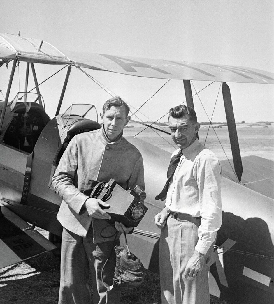
At a time before “innovation” became a marketing cliché, Leo White (1906-1967) was a spectacularly energetic innovator both as an aviation pioneer in his earlier days and a hugely successful businessman later. Personally he seems to have been a very engaging character, widely known and loved. Throughout his relatively short life he maintained a boyish spirit: up for any challenge and able to fully but modestly enjoy his many achievements. In a very real sense this is his book, and as the result of prodigious research Alsop tells his story with thoroughness and panache.
Peter Alsop
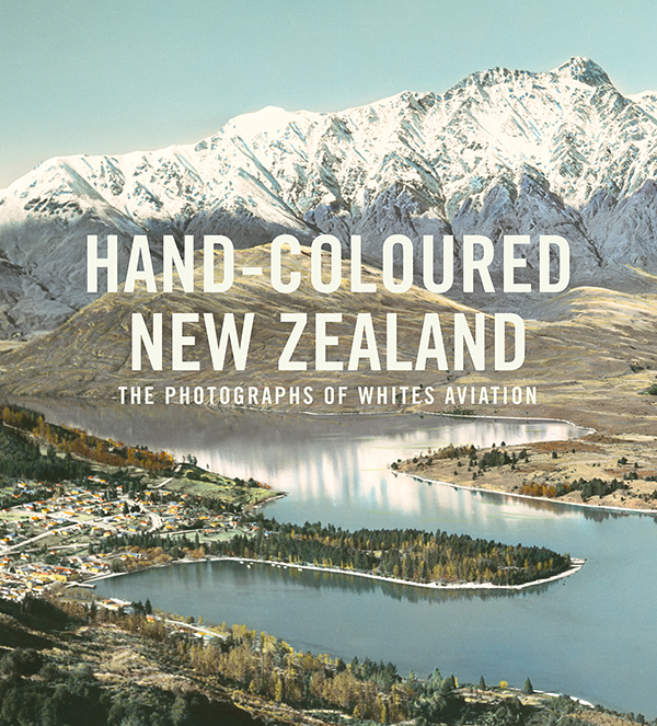
Hand-coloured New Zealand: the photographs of Whites Aviation
Hardcover, 417 pp
RRP $79.99
Potton and Burton, Nelson, November 2016
Necessity being the mother of invention, photography came to be through a series of planned and accidental stages - from the early 1820s to the early 1840s - in the service of science, to assist with the great project of cataloguing and explaining the physical world in all its rich diversity. At the time, what must have seemed miraculous realism was missing one key element of naturalism: colour.
From the very beginning attempts were made to hand-tint the greys and sepias of the imagery to supply this lack, but the processes used and the chemicals involved allowed only the vaguest suggestion of colour, and almost nothing of the immediacy of nature. As the medium developed, particularly with portraiture, liberties were taken to the extent that the entire surface of photographs was painted, either in oils or with gouache. The paint may have masked the materiality of the photograph but the photographic image survived by illustrating the accepted conventions of studio photography.
Parallel to these additional artistic efforts attempts were made to invent stable colour processes inherent in the film stock. There had been experiments as early as the 1860s to introduce colour into the process, but they tended to be one-offs and extremely complicated to resolve. Towards the end of the 19th century the Lumiere brothers invented a method patented in 1906 they called autochrome - still complex, but conveying the richness of naturalism - and that remained the most common means of colour reproduction until the 1930s, when Kodak and Agfa came up with commercially viable and relatively easy-to-use colour film. But it wasn’t until the later 1950s in New Zealand that colour film was taken up by most amateur photographers.
Photography, the child of science, has always had a somewhat tortured relationship with fine art, and in a quite vital and contentious sense this situation continues. In the later 19th century those photographers who hankered after being considered artists aped contemporary art styles in a movement called Pictorialism, a style trashed by the 20th century’s Modernist movement. However this aspiration to art is very much alive today, a parallel that might give some pause for thought among those photographers and curators involved, were they historically attuned enough to be aware of it.
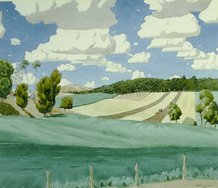
Towards the end of the 19th century the accumulated experience of - and experimenting with - hand-colouring arrived at a kind of style involving the transparent application of very thin oil paint, the colours not quite naturalistic, but within the separate tradition consistent, credible and convincing. This very commercial production continued confidently until around 1960 - when more naturalistic cheap colour film began supplanting its supremacy. After that it limped on here and there for another two decades, and over that time and since, it has become almost the sole province of various forms of artists’ practice.
For practically all of the 20th century what got designated art depended on the agenda set by the Modernist movement’s beliefs about originality, purity and formal abstraction. Most hand-coloured photographs failed on all three counts. Firstly, they lacked originality, since practically all of them relied on compositional principles established by the Rev William Gilpin in the 18th century, the period of the Picturesque. Secondly, the purity of the photograph was seen to be compromised by the addition of a foreign substance, paint. Thirdly, the subject matter was unabashedly realistic (1). So, at best, hand-coloured photography was judged as being a branch of perhaps folk art and the province of history, or even geography, rather than art. There is not yet a published comprehensive history of photography anywhere on the planet which gives more than a passing mention of the lengthy and very widespread tradition of hand-colouring. Rather like Mrs Rochester, it has been confined to an attic and resolutely not spoken of.
Around thirty years ago, though, and perhaps a sign of the more pluralistic approach offered by Postmodernism, various independent collectors around the world started acquiring examples of hand-coloured photography, viewing them as objects of cultural production worthy of belated attention, and there is now appearing a range of publications reflecting this growing interest, one that is eventually bound to segue into more comprehensive coverage in newer photographic histories. Watch that space.
The two firms in New Zealand dominating the hand-colouring industry from after WWII to the early 1960s were Whites Aviation and Christopher Bede: the first specialising in landscapes and the latter portraits. Peter Alsop’s book tells the story of Whites Aviation Limited in a pioneering volume which could be the first major publication devoting specific attention to the phenomenon of hand-colouring photographs.
The book is divided into two broad parts: the first, a series of five chapters, chronicles the origins and history of the firm through the characters who founded it, ran it and made it the success it became: founder Leo White, his business partner Clyde “Snow” Stewart, and - representing two generations of female colourists - Grace Rawson. Towards the end of this section are several pages looking at contemporary hand-colouring and some of the people who have been collecting examples of Whites Aviation hand-coloured photographs. The second part of the book is a gallery of two hundred and four pages illustrating 181 images coloured by Whites (2).
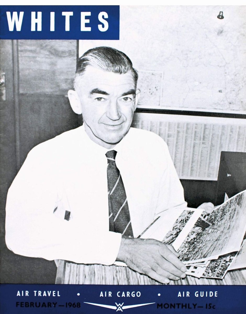
At a time before “innovation” became a marketing cliché, Leo White (1906-1967) was a spectacularly energetic innovator both as an aviation pioneer in his earlier days and a hugely successful businessman later. Personally he seems to have been a very engaging character, widely known and loved. Throughout his relatively short life he maintained a boyish spirit: up for any challenge and able to fully but modestly enjoy his many achievements. In a very real sense this is his book, and as the result of prodigious research Alsop tells his story with thoroughness and panache. The many and varied illustrations, beautifully reproduced and paced, amply support the text and add spice to this story full of human interest. This chapter is accurately titled Mr Aviation: Leo White’s life of thrills.
The following chapter, Unsung Hero: Clyde Stewart’s colourful life, tells the story of Leo White’s business partner. They met through their passion for flying, with Stewart becoming White’s studio manager - while shouldering most of the aerial photography - and carrying on the business for a further fifteen years after Leo’s untimely death in 1967, retiring in 1982. Another remarkable character, he seems to have inspired pride and loyalty amongst the firm’s employees.
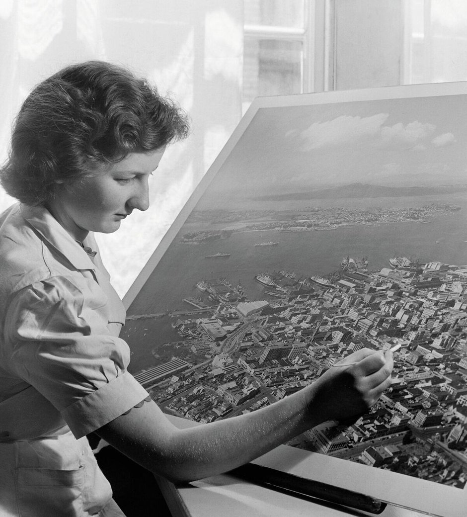
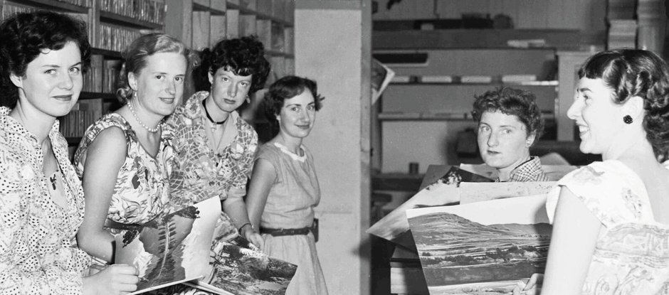
Colourist Grace Rawson stands in for the firm’s many such employees, and her chapter One of the Girls is not only an account of her own training and life as a colourist but conveys the close-knit collaboration reigning in the Whites’ studio and socially outside it.
The final 93-page chapter of the book’s first part, Colouring Business: The Legacy of Whites Aviation - again, generously and broadly illustrated - is Alsop’s own and interweaves a history of the firm with a sketch of hand-colouring generally from its inception to the present day, putting both in a wider context that very satisfactorily concludes this fascinating story.
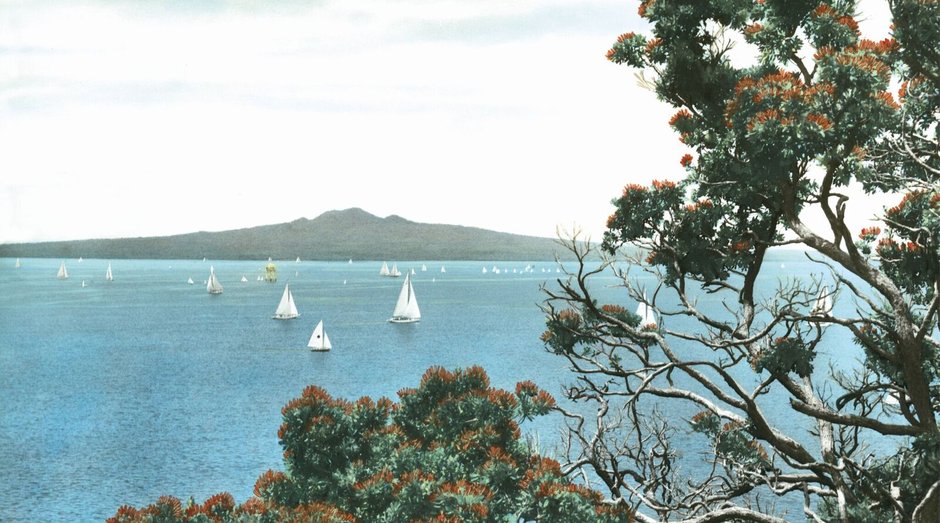
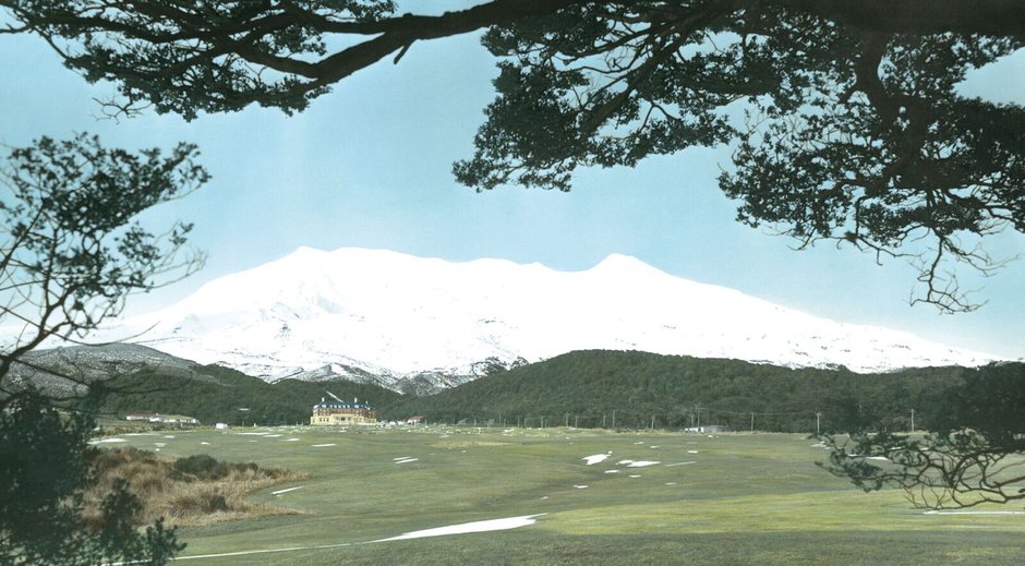
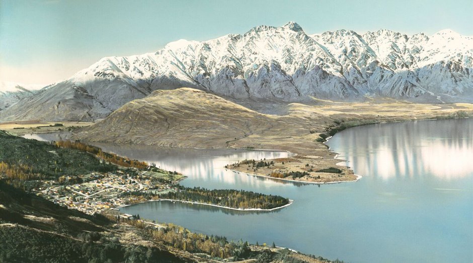
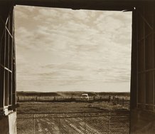
As noted above, the book’s second part consists of a gallery of nearly two hundred Whites hand-coloured images. The word overkill rather too readily comes to mind, and there are a number of reasons for this response. Firstly, while the firm’s production was a notable achievement historically and commercially, artistically the work was produced within a very narrow range in terms of both composition and colour. With the slight exception of the aerial images, the rest were securely bound by the rules established by the Picturesque in the 18th century - and paying tribute to that movement’s reverence for Nature. Generally, the views privilege the unspoilt, and any human presence - figures or vehicles - exists to give scale and reinforce the awesomeness. And while in its early days the firm’s colour tended to a darker palette, by the early ‘50s it had become aligned with the prevailing pastel tones characteristic of that decade. For experts there can be diverting differences - the colour of the foreground stones in the well-known Clearwater image, for instance (3) - but for a general public such a comprehensive assembly of images risks the impression of an over-arching blandness which does the memory of Whites a disservice. The point of the firm’s aims and achievement could have been well made by half the number of reproductions.
Secondly, considerations of the book’s design seem to have over-ridden a certain respect for the images themselves. Fifty-two of them are spread double page across the gutter and bled to the edge. While this gives a degree of “light and shade” to the look and pace of the book, none of the images was ever presented in this way, and where the gutter also involves the sequence of nine stitchings you can almost feel the “colouring girls” wincing at this disruption of their careful work.
Thirdly, a hundred and five of the reproduced images come from the author’s own collection. While this bounty is understandable from an enthusiastic collector, had Alsop the collector deferred to Alsop the editor the book might have been more focused and convincing (4). Any history freighted by what essentially are statistics is seldom a success. Statistics are part of the research, not the final product.
The book impressively contains a lot of useful and interesting information, so there’s some competition for space. The major casualty of this for any reader is the placement of captions. The book could almost be subtitled Needles and Haystacks. A PhD in forensic research would certainly be an advantage for the keenest reader. There is even caption - for the image on page 417 - buried in the notes on page 412. The whole thing is just maddening, and a publisher as experienced and devoted to quality as Potton & Burton should be more alert to the capacities of the general reader.
Peter Alsop’s enthusiasm for his subject drives both his personal collecting and promotion of neglected causes that range from tourist posters through artists such as Marcus King to now Whites Aviation’s hand-coloured photographs. As an entrepreneur, though, he’s less likely to critically examine the admittedly unintended impact of the Whites’ images on the rather nationalist construction of an unspoiled New Zealand, that forms the base of the grossly inaccurate and environmentally dangerous 100% clean-and-green mythology. That is part of the Whites Aviation story too. New Zealanders of the 1950s may have felt pride in their country through their connection with Whites’ products (and another part of the story is why they had need for such pride), but in hindsight they were buying into a romantic and retrograde view that effectively blinkered them against the growing and pressing realities of land use and ownership, having implications well into the 21st century.
All that said, Hand-Coloured New Zealand remains a significant achievement, with the author’s work in foregrounding this hitherto neglected aspect of photography’s unique history deserving the sincerest salute.
Peter Ireland
(1) With many of Whites aerial views - despite the obvious realism - there was often a formal abstraction in the composition paralleling (however superficially) the European New Objectivity movement of the 1920s and ‘30s.
(2) Whites had a good nose for the market; two of the images feature the famous Pink and White Terraces destroyed in the 1886 Tarawera Eruption, retrospectively hand-coloured.
(3) A comparison can be made between the one in this book on pages 72-73 and one on page 11 of New Zealand: a century of images by Paul Thompson, Te Papa Press, Wellington, 1988.
(4) And a lot lighter. It’s a coffee table book because it needs a piece of furniture to support it.
Recent Comments
Ralph Paine
So many column inches, so little “spirited discussion”.... And then, straight outta the blue, a very welcome and f-ing hilarious ...
Peter Ireland
Thank you Peter. As to my “art world utopia” I can only quote Hunter S Thompson on the music industry: ...
Peter Alsop
Peter, what you are describing – and we agree on – is the importance of review integrity and editorial control. ...
 Two Rooms presents a program of residencies and projects
 Advertising in this column


This Discussion has 11 comments.
Comment
Peter Alsop, 12:57 p.m. 29 January, 2017 #
(1 of 4)
THAT AGE-OLD QUESTION: WHO REVIEWS THE REVIEWERS?
Peter’s ‘sincere salute’ for the book is appreciated given his long-standing interest in the subject matter. Overall, I read it as a fairly positive review – relief! But there are aspects of the review that go beyond a top-line personal emotion and warrant closer inspection; aspects also reflecting important principles relevant to other reviews. I have set out my views over 4 comments below (given length restrictions per comment) and acknowledge my conflict of interest as the book’s author.
GOOD FORM
In other professions, it’s commonplace for reviewers – in settings where rationale matters – to share draft findings with reviewees for scrutiny. Some circles call it ‘natural justice’; others have a legal obligation not to impugn others’ interests without consultation; in the pub you’d probably just call it ‘good form’. I can already hear the cries: the visual arts are different! Yeah Right. I come back to this topic at the end.
NO DISCUSSION OF PRODUCTION TRADE-OFFS
A lot of trade-offs are confronted in producing a book like Hand-Coloured New Zealand. The trade-offs are very real, with pros and cons, and are sometimes painful decisions to make.
To meaningfully test those trade-offs – as key determinants of the product’s standing – they need to be discussed. In my view, Peter doesn’t give his readers any hint of the trade-offs (let alone explore them), or mention alternate perspectives readers may like to consider for themselves.
A reviewer’s preference for the outcome of trade-offs, without interrogation and rationale, is no more valuable than the passing and unqualified (arts-wise) opinion of any other person on the street. Surely that's not the intent of ‘critical reviews and spirited discussion’ on a website aiming for ‘the intellectual climate of this country’s art community … to become more sophisticated’?
Peter Alsop, 12:57 p.m. 29 January, 2017 #
(2 of 4)
NO DISCUSSION OF THE REVIEWER’S ALTERNATIVE BOOK FORMAT
Peter takes umbrage at large double-page images crossing the book’s gutter – I never would’ve guessed he’d raise this! These are the same images that, not mentioned, are probably the biggest published reproductions of New Zealand photography, ever. Why? Because scale was undisputedly a cornerstone of Whites Aviation’s photographic philosophy and enduring success.
For the book, a page ratio was chosen – explained in the book but not mentioned by Peter – so that the double-page spread matched the ratio of the larger Whites images (roughly 70x40cm and 100x60cm). I thought this was a very honourable intent. In my view, the visual impairment of the gutter in such a large-format book is minor. I’m confident most people also realise they're looking at the images in a book!
Peter disagreed. His alternative – not discussed – can only have been much smaller reproduction of Whites images or, to get at least some scale, a very, very elongated landscape-ratio book (and, even then, much smaller images). Would most readers have preferred much smaller images? And, for that (odd) elongated page, how would that have supported the large black-and-white photos in the first 200 pages? Such a trade-off (and there are others) is completely irrelevant, it seems, to a critical review.
SPECULATING ON OTHERS’ VIEWS TO SUPPORT A PREFRENCE
Peter argues the ‘colouring girls’ would be ‘wincing at this disruption of their careful work’. This is a ridiculous claim and, with good form, I could have provided Peter with phone numbers to check. These are also people who, hitherto, have gone 40-70 years without any recognition of the artistic value of their work – they have some perspective. More fundamentally, should a reviewer rationalise their own preference by speculating on what some other people might be thinking? Goodness me.
FACTUAL ERROR ABOUT FULL-BLEED IMAGES
Peter also objects to the full bleed of the big images and claims ‘none of the images was [sic] ever presented in this way’. This is fundamentally incorrect. Those original photographs were all, without exception, full bled by Whites to the frames. I know this from discussion with members of both the White and Stewart families, including Ross White who mounted the photos on the boards. I have also personally de-framed a couple of hundred, which takes us nicely to the next point.
ERRONEOUS CLAIM ABOUT COLLECTION BIAS
Peter mentions it was wrong to use so many images from my own collection. It follows that Peter would have been happier, it seems, if I’d just referenced the images ‘Private collection’ or, instead, spent much more money digitising the very same images from institutions or other private collections. It seems to me that Peter’s raising collection bias while displaying collection bias. Has commentary on the visual arts really stooped – or perhaps returned – to the level of which collection holds the gold?
Peter Alsop, 12:58 p.m. 29 January, 2017 #
(3 of 4)
POORLY ARGUED PREFERENCE FOR LESS IMAGES
Peter claims that the book contained too many images and the book’s intent could have been achieved with ‘half the number of reproductions’. Yes it could have been – I agree – but with some other adverse impacts and implications Peter completely ignores.
Clearly, a much shorter book would have had a very different level of presence and impact and – heaven forbid – offered less value-for-money. So, in all likelihood, there would have been less reviews (of all qualities), less visibility of the book, less Whites’ resuscitation, less understanding of this thread of social history and less consumption of the visual arts. Awesome!
This matter must also be considered in the context of the Whites gig: scale, diversity and documentation of New Zealand from, as Hamish Coney puts it, ‘stem to stern’. Beyond book impact, removal of 120 location-specific images would have made quite a geographic dent, with much less book appeal (one might expect) in specific towns and cities around New Zealand. Peter brushes this all off as worthless ‘statistics’. Personally, I make no apology for writing a book to be read. I sincerely doubt whether many readers will be cursing the (extra) imagery – and, even if so, they’d be selfish to want, say, Whanganui removed.
GROSS OVER-REACTION TO CAPTIONING
From images to fine print, Peter found the book’s captions ‘maddening’. An alternate sub-title was suggested: ‘Needles and Haystacks’ and ‘[a] PhD in forensic research would certainly be an advantage for the keenest reader’. If any humour was intended, it was unfortunately lost on me.
With or without my conflict of interest, these are grossly exaggerated (bee-in-bonnet) comments, to the point of lacking credibility. Beyond being condescending to me, Peter is also condescending about ‘the capacities of the general reader’. Personally, I’d back my 7 year old son to find the captions.
I recognise that some captioning in the essays is not as tightly aligned to specific images as someone like Peter would prefer – I expected him to raise this. The chapter starters, for example, had delayed captioning for design simplicity, and to avoid captions sitting on images like a cheap magazine. Peter has a different preference for a different trade-off but, well, so what?
The captioning of the Gallery is, in my view, well-explained and straight-forward. At the end of the book – a key source of Peter’s outrage – there are 11 ‘Residual Image Credits’ clearly titled in the Endnotes (including the now infamous reference for the book’s Endpaper on page 412: Outrageous!). If you’re feeling tired, yes you read correctly: there were 11 (eleven) residual image credits ... in a 417 page intensively-illustrated book. Some art books have their entire image referencing in the back! It’s ‘maddening’ to read Peter's pedantic (and outdated?) preferences on this matter.
Peter Alsop, 12:58 p.m. 29 January, 2017 #
(4 of 4)
BACK TO GOOD FORM
Being on any public soapbox is a privilege, and one that needs to be exercised with more care than evidenced in this review. There really are (at least) two sides to every story.
There’s an increasingly audible societal sigh at being force-fed poorly justified opinions that lack balance and openness to alternate perspectives. Of course context matters: people have different expectations for Facebook comments than, say, a professional website specialising in critical review. EyeContact seeks a ‘more sophisticated’ arts community and review environment. What’s the development plan? Does EyeContact have any published expectations of reviews? A process for considering and managing conflicts? Etc.
Good form has a lot going for it in most walks of life. In restaurants, you talk to the Manager before preaching to the world on Trip Advisor. More generally, a reviewer keeps holding the pen; rough edges are rounded off; and arguments are sometimes changed with the benefit of productive exchange. Radically, facts can also be corrected. (I still find it astounding that David Eggleton criticised a non-chronological book of mine for being chronological – and still hasn’t corrected the review.)
Perhaps I’m blind to reviewers who do have good form? Perhaps there’s a deeply held belief by most reviewers that good form would corrupt the integrity of their soapbox? A belief that consulting a creator before publication leads to a weaker rather than stronger review? Seriously? Or that the work should only stand in its own right (making, of course, all reviews inappropriate)? The message one gets is that nothing valuable, in any possible way, could stem from good form. Dear Reviewers. Can you please reconsider? Good form stems from a trade-off: less ego; more EQ; same editorial control; stronger reviews in print. Kind regards. Peter
Peter Ireland, 10:16 p.m. 30 January, 2017 #
Most of Peter Alsop’s reservations about my review come down to a difference of opinion and it seems pointless to do anything other than accept that. Where we’re in sync is I take the job of reviewing as seriously as he takes his research and authorship. And sometimes even critics are as protective of their work as authors are of their books.
There is one central issue, though, needing to be addressed: what he calls “good form” in the matter of reviewing practice, suggesting reviewers first submit drafts to those concerned for their comment before publication. However much this sort of collaboration may feature – very sensibly – in some professions (such as, say, engineering) – it goes against long historical practice in art and literature, and for a very good reason. Reviewers consider an actual finished product, not what might have been. While publishing can be a fraught business involving what Alsop calls trade-offs, these are and cannot be the business of any reviewer. He may find some consolation in regarding art and literature claiming some kind of special status, but his personal feelings are of no account in the historical and critical spectrum of things.
In sixty years of pretty wide reading I’ve never come across anything remotely like his notion of “good form” when it comes to reviewing and critical practice. Besides, his concept of good form seems to have somewhat limited capacity. After all, he first submitted his concerns to the editor of the site, not to me.
My distinction between the author as editor and as collector has nothing to do with collections or even competition. As clearly stated in the piece my disputing the number of published images was based on the limited compositional and colour range of Whites productions. Nothing more.
In the second section Alsop adds a “[sic]” to my use of the verb “was”. Well, the subject “none” is a contraction of “not one” which is singular, not the plural a “were” would accompany. At the risk of reinforcing my apparent reputation as a pedant I would point out that in the third section Alsop refers to “less reviews” when “fewer reviews” would have averted a [sic]. Those who live in glasshouses…..
Peter Alsop, 12:27 a.m. 1 February, 2017 #
1/2 Response to Peter
Peter, thanks for your thoughtful comments in response. 10/10 for grammar! (I certainly can’t compete on that front.)
It seems a shame to start a response by suggesting, in effect, ‘this is all about different preferences so let’s agree to disagree’.
There are some facts at play here. For example, the large Whites images were full-bled to the frames – a fact you got wrong in criticizing full-bled images. It’s clear you relied on speculation to support your view against images over the gutter; you ignore this as if speculation is OK. It’s clear that your review can only be read as supporting much smaller reproduction of images, and less images – without, it seems, a duty of responsibility to discuss the pros and cons of those opinions (I come back to trade-offs below).
On image quantity, you note that: ‘As clearly stated in the piece my disputing the number of published images was based on the limited compositional and colour range of Whites productions. Nothing more.’ If that were true, it would be concerning – it can’t be meaningful to form your view on only one factor and ‘nothing more’.
In the review, however, you gave three reasons (Firstly, Secondly, Thirdly if I read correctly). Are you agreeing that reasons (2) and (3) were as specious as I pointed out?
Peter Alsop, 12:28 a.m. 1 February, 2017 #
2/2 Response to Peter Ireland
I did think about running my response past you but, given your revealed preference, questioned the value! By being unable to resist the (understandable) jibe, I take it you’re suggesting that good form can have some value?
More fundamentally, your principled response about good form - ‘it goes against long historical practice in art and literature. ... Reviewers consider an actual finished product, not what might have been.’ - seems so vague as to be meaningless and, in practice, impossible to sustain.
Essentially you're saying a discussion would corrupt the purity of a review (whatever that really means).
Are you saying a critical reviewer has never ever spoken to a creator about their creation pre-review? (Perhaps, say, talking with an artist at an exhibition opening or a book launch? Perhaps listening to a creator speak to a crowd to launch their exhibition or book?) Is it OK to talk with them a few weeks before while the work is being completed? Is it OK to talk to a curator or gallery owner about the work? Other professionals to be informed by their views? Draw on knowledge about artistic preferences, influences and drivers from previous discussions? From other published work? I just don’t see how the nebulous principled position you describe can be sustained.
It is also bizarre in my view to claim a reviewer is only focused on ‘an actual finished product, not what might have been’.
You may claim you are reviewing art or a book in an ‘absolute’ (how it is sense), but your views are always laden, inescapably, by ‘relative’ assessments (as they are for anybody). Any observation is, implicitly or explicitly, anchored to a particular frame of reference; some implicit criteria in our heads; or some notion of benchmarking (to other work or some standard or worthiness we have implicitly or explicitly defined).
For example, any observation that some artworks are subjectively too small, is a judgment that they would have been more worthy in some way from being bigger. That is a relative assessment. Commenting that my book contained too many images, is a relative judgment that the book should have been shorter. This is precisely my point – the trade-offs are fundamental to your review judgments; they cannot be ignored.
For you to suggest that such trade-offs ‘cannot be the business of any reviewer’ is really quite alarming to me. Trade-offs aren’t publicly relevant when I see a new artwork and think ‘nup, it doesn’t do it for me’. But for a published critical review, understanding and exposing the trade-offs that are fundamental to your opinions seems, well, central to performing in your job. (And ‘good form’ would help without diminishing your editorial control.)
Peter Ireland, 7:22 p.m. 1 February, 2017 #
Peter, your notion of “good form” in relation to the reviewing of art and literature is a personal invention (in plain words, wishful thinking) that has no precedent in at least the past two hundred and fifty years of critical practice. And I repeat, for the very good reason of estimating what’s there, not what might have been. You claim this view is unsustainable, but the facts are it’s been sustained, unbroken, for more than two centuries. If the notion of sustainability needed some hard historical evidence this could be it!
Of course reviewers and critics bring a whole range of knowledge and experience to their work: they need to. But most of them would avoid debating beforehand the merits of the item under review with the so-called creator - they have done their work and have put it in the public domain. However much you find this peculiar – and to some extent objectionable – it’s fundamentally about independence (not “purity”). Which, practically, means avoiding any kind of spin. It can’t be put more plainly. If you still find this “vague” and “meaningless” then there’s nothing more I can say.
Any practiced reviewer or critic knows their credibility depends on knowledge, judgement and fairness (the laws of libel and slander are a factor too) and they’re aware their readership will desert them should they stray too often from these paths of discipline. But none of them is infallible – just as no author/creator is infallible.
Peter Alsop, 12:22 a.m. 2 February, 2017 #
Peter, what you are describing – and we agree on – is the importance of review integrity and editorial control. No question about that. I do like being in agreement with you!
What concerns me, however, is that you are confusing the independence of the output with the process of enquiry and information-gathering to underpin, and hopefully ensure, a high-quality review.
Given the sorts of grey areas I noted in my last response, it is wishful thinking, to borrow your phrase, to pretend the process of enquiry and information gathering is independent. And it doesn’t need to be. (It isn't in every other walk of life where independence is critical and - as much as this conflicts with your art-world utopia - it isn't in the visual arts.)
Connections and discussions, including with creators in the past or present, do not compromise independence or integrity, unless the connections are entangled in ways that constitute a conflict of interest. (There are very well-established guidelines for what those conflicts are - something perhaps EyeContact should publish).
You’re also now saying that ‘most’ reviewers would avoid debate with a creator. So some do? But you’re also saying there’s no precedent for my view in 250 years?
Personally I didn’t expect debate. What I did expect, though, was a high-quality review. And when a reviewer gets facts wrong (an easily avoidable error) – or when a reviewer indulges in speculation and could have undertaken more reasoned enquiry – a reviewer can expect to be asked why they didn’t talk to people that could have helped. In this case, that could have included me.
It is convenient for you to brush this off to the future, noting readers will ultimately ignore poor review (readership stats and review ratings (as much as I recall you dislike these?) may help). But deflecting to how popular a reviewer may be in the future does not negate the reasonableness of debating a review report card now.
For me, summarising, the report card includes an important factual error; using speculation as rationale; ignoring the purposeful page ratio; and ignoring key aspects of the Whites’ creative philosophy (scale, prolific production and geographic diversity). Reading back, I don’t think you’ve engaged on any of these points that I raised.
Post the review, you’ve claimed you don’t make relative judgments (speaking of new things in the history of humanity); that trade-offs aren’t relevant to a reviewer (even though they underpinned your opinions); that the pros and cons of an alternative preference don’t need to be exposed in a critical review; and that a process of enquiry can and should always be completely independent of a creator in any and all respects (while also noting that isn’t always so).
But, hey, I’m just a creator; someone who’s ‘feelings are of no account in the historical and critical spectrum of things’, raising only ‘differences in opinion’.
If nothing else, we’ve covered some ground.
Peter Ireland, 9:41 a.m. 2 February, 2017 #
Thank you Peter.
As to my “art world utopia” I can only quote Hunter S Thompson on the music industry: “The music business is a cruel and shallow money trench. A long, plastic hallway where thieves run free and good men die like dogs. There is also a negative side.”
Ralph Paine, 5:07 p.m. 2 February, 2017 #
So many column inches, so little “spirited discussion”.... And then, straight outta the blue, a very welcome and f-ing hilarious Hunter S. Thompson quote is dragged on stage to provide the finishing gag. Yeah, I can picture Hunter S. right now, off in some beautiful tree-lined field in Gonzo Heaven using Mr Alsop’s book for target practice.
“Good form” is just another name for “good sense” or “common sense”, and in my view all signify as “order words” (D&G) or differently nuanced versions of CONTROL. In many ways the art scene ain’t really like the music scene, but these days the “gig economy” plays its duplicitous and controlling hand in all “scenes” precisely as GOOD FORM. Talk to scientists, talk to artists, talk to writers, talk to whoever out there trying to pay off the debt: PEER REVIEW is a money trail.
Participate
Register to Participate.
Sign in
Sign in to an existing account.