

John Hurrell – 26 April, 2013
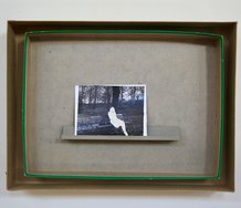
These works are very much about interiority, contemplative observations about the artist's romantic calamities, her public persona being transmuted through tropes into dramatic figurative images. It's self-mythologising perhaps, an artist's private narrative resourcefully constructed and promoted; however they can also be seen as powerfully put together images, if you like seeing how different types of mark work together.
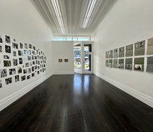
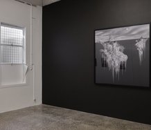
It is almost thirty months since Whitney Bedford’s first exhibition at Starkwhite, with the Los Angeles painter now returning to present a slightly wider range of paintings than previously. (No ducks or palm trees.)
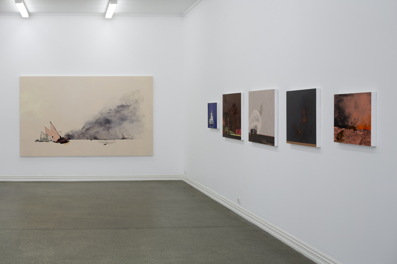
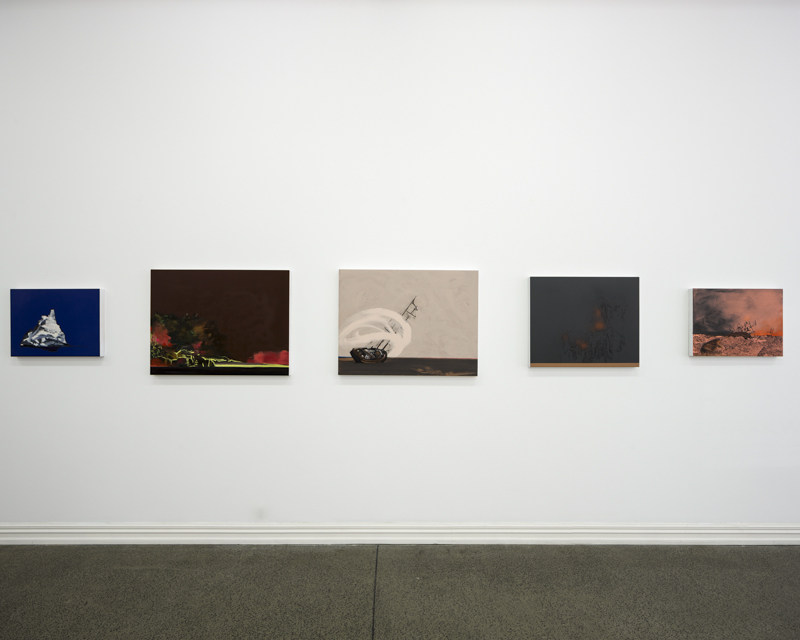
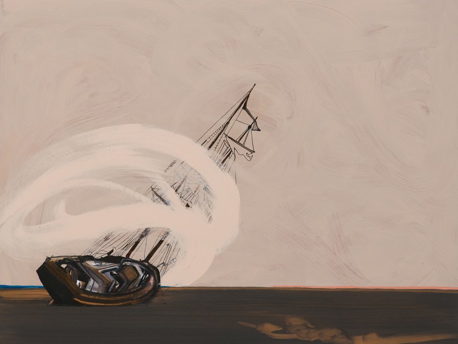
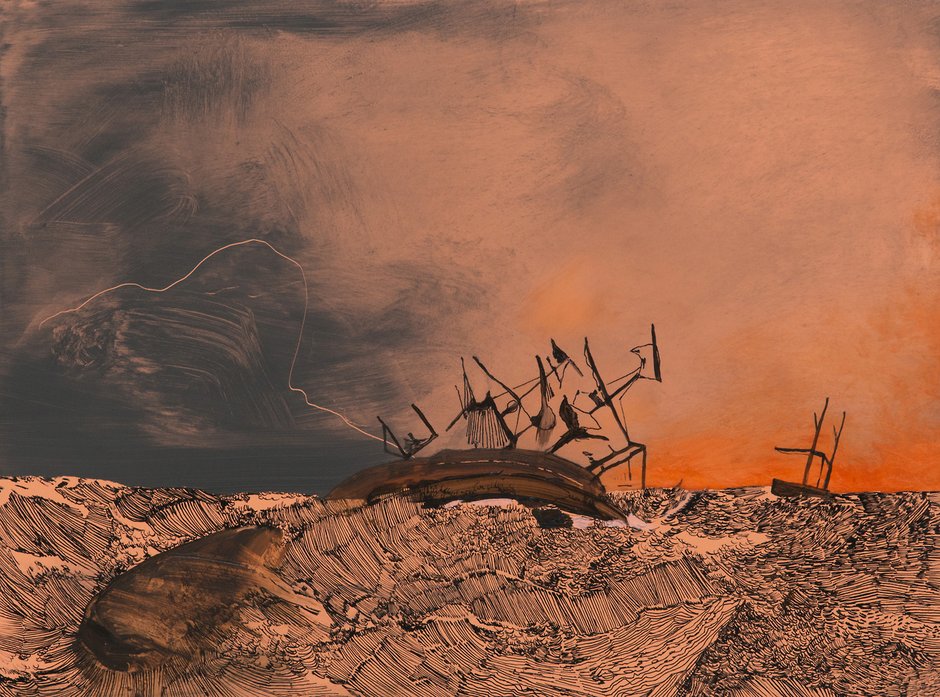
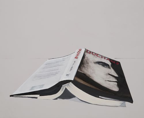
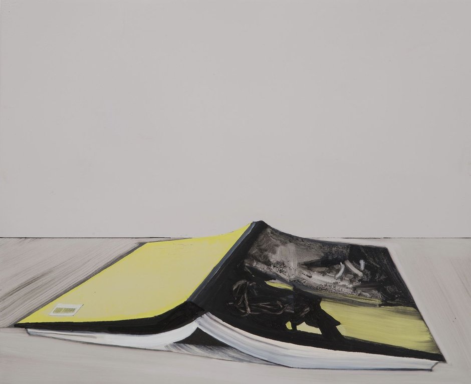
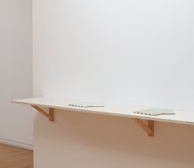
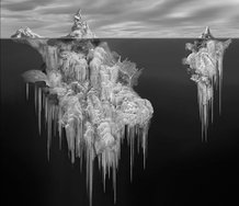
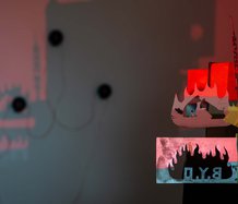
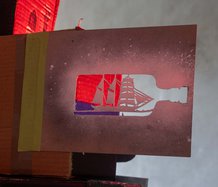
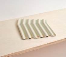
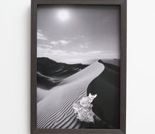
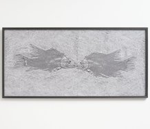
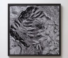
There are eight images in total: two opened books facedown, two highly abstracted ‘landscapes’, one solitary iceberg and three wrecked sailing ships. All featuring her characteristic personal symbolism: similes (rather than metaphors) that hypothetically reference their creator’s emotional state. Like say, Mark Tansey or William Sasnal, she works to some degree within the genre of illustration, but with very different intentions.
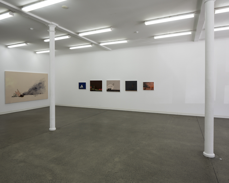
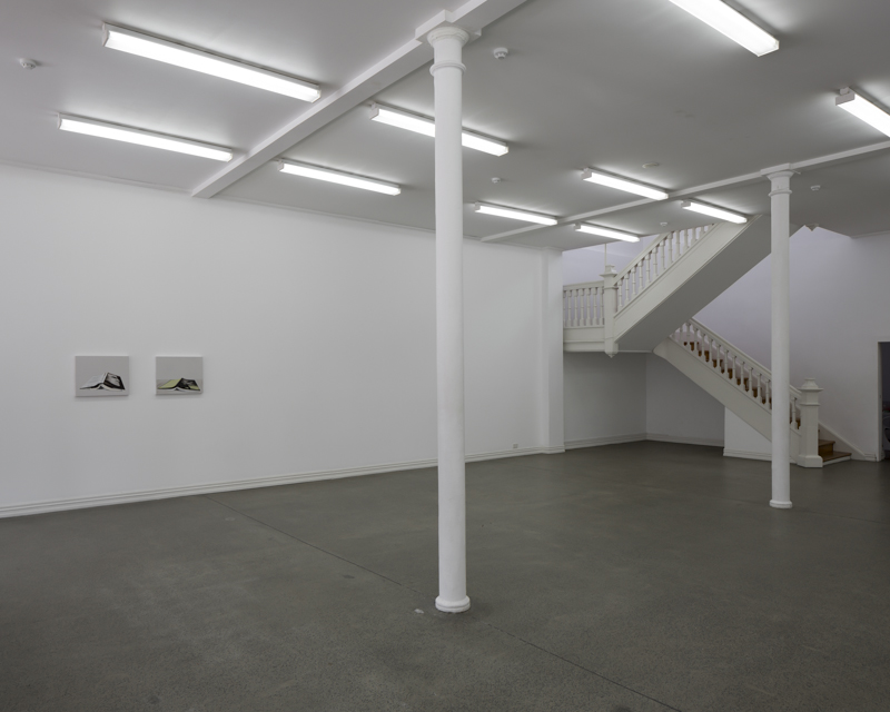
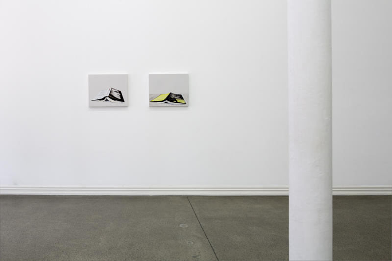
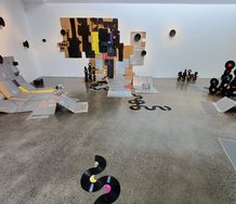
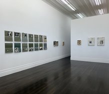
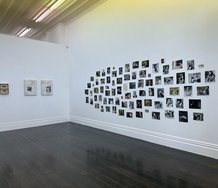
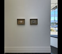
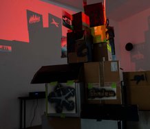
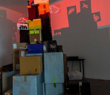
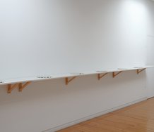
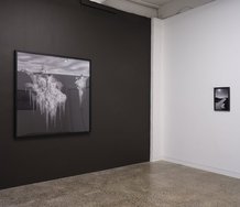
There are two isolated groups: two ‘book’ paintings near a corner by the street front window; the other six in the opposite corner - a large canvas on the short wall by the office and five in a row on the long wall. Bedford used the same corner last time.
Often using narrative drawing techniques to allude to historical events and landforms in the ‘real’ world, these works are nevertheless very much loaded with personal meaning - about interiority, contemplative observations about the artist’s romantic calamities, or her public persona transmuted through tropes into dramatic figurative images. It’s self-mythologising perhaps, if you consider these paintings to be merely an artist’s private narrative resourcefully constructed and promoted; however they can also be seen as powerfully put together images (if you like examining paintings) seeing how different types of mark work together.
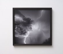
The fascination that Bedford’s work generates lies in the mixing of abstract expressionist gestures (that by themselves would be clichés) within illustrations for what could be sailing adventure stories. The brush marks somehow get revitalised when dropped into a strange new context. Vigorous wiggles and smudgy traces become sweeping calligraphic swirls wrapped around clippers in peril, or else more subtle, dry brush scumbling gently shuffling across the sky - smokily softening a darker underlying hue.
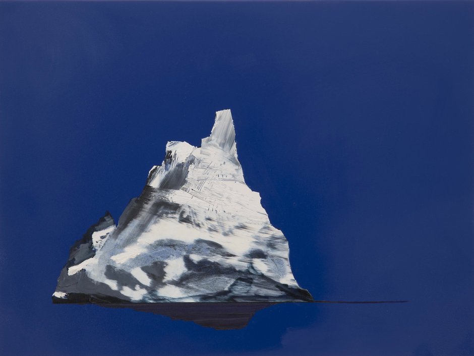
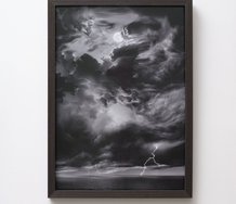
Sailing ships have been used by many artists like Marcel Broodthaers, Susan Hiller and Mariele Neudecker. Here they symbolise relationships (‘on the rocks’ literally), while an iceberg set against a deep blue seems to mean the artist’s impassive public exterior, and maybe loneliness. The chroma is quite overpowering.
The great South African/Dutch portraitist Marlene Dumas has this to say about blue:
Blue is the colour of distant longing of which the realisation lies far away. Blue…stands for going ‘over the seas’, over the horizon. The medieval word oltramarino means ‘over the seas. It was not just used for blue but also represented imported goods. 1.
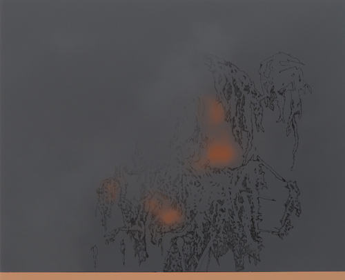
The deliberately oblique abstractions that allude to landscape or geological morphologies are more esoterically private. One is tempted to say ‘experimental’ because they seem to delight in the pleasures of mark making - the thrill of presenting clusters of separate multi-hued strokes or sprayed gaseous blobs, and seeing whether they cohere or hover in isolation. They are ambiguous and vaguely representational: A smudgy explosion can also be a scruffy hill with cliff and stumps, or angular twigs crystalline formations.
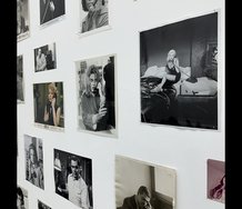
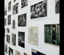
The strangest of non-illustrations, these link to the books (about Duchamp and Rothko) from the artist’s library depicted on the other side of the room - symbols for attempting to understand these historic figures as well as votives to the act of reading and self-education; traces from a ritual involving sympathetic magic that cranks up the artist’s curiosity and energy, and perpetuates her gaining of knowledge.
The spatial separation here in the gallery seems pointed, as if the ships and iceberg represent the life of the heart, the books that of the mind, and the ‘abstractions’ a mixing of the two, a straining towards a middle ground. They seem more process driven, not designed to be finally resolved, but left open - with an idea in suspension. Instead of ‘This for that,‘ as in the show’s title, a ‘This for what?’
John Hurrell
1. ‘Marlene Dumas on Jean-Auguste Dominique Ingres’, In My View: Personal Impressions on Art by Today’s Leading Artists, ed. Simon Grant, Thames & Hudson, 2012, p.80.
 Two Rooms presents a program of residencies and projects
 Advertising in this column
This Discussion has 0 comments.
Comment
Participate
Register to Participate.
Sign in
Sign in to an existing account.