

John Hurrell – 7 November, 2012
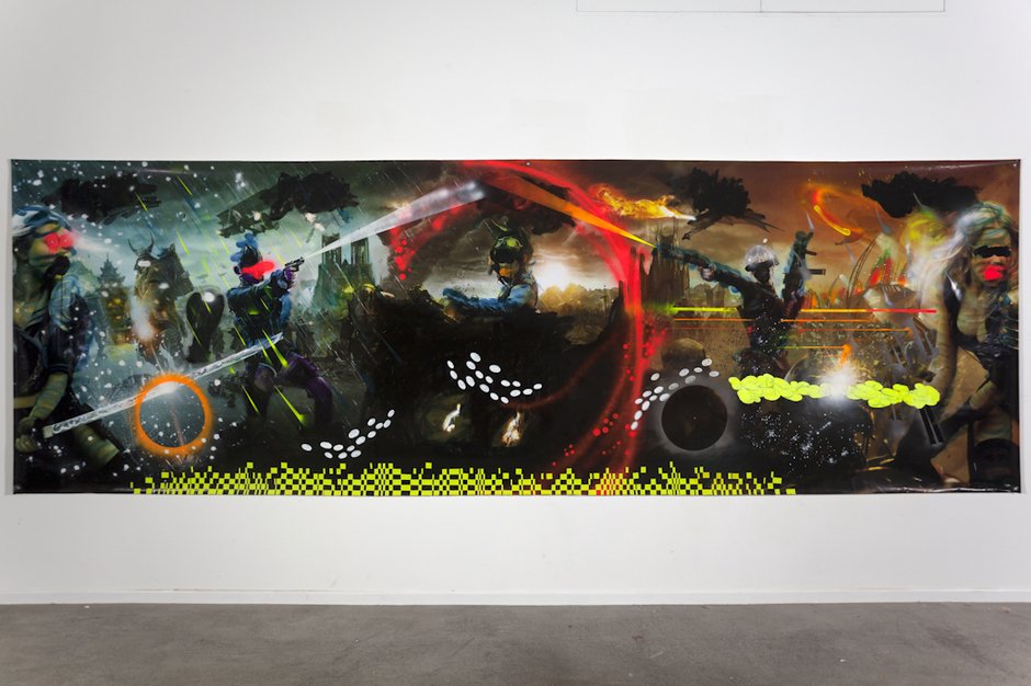
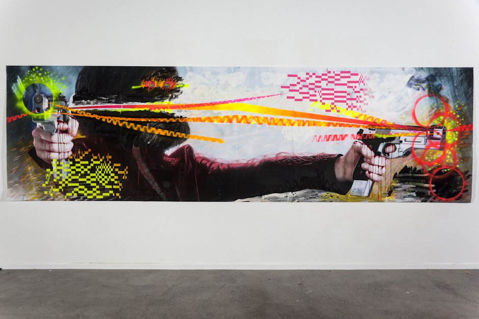
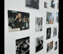
I like the way she defaces these Hollywood advertisements with relish. Her joy in malicious markmaking is akin to graffiti - but not tagging with signs to be recognised as calling cards. Instead she mocks ‘action' by vandalising the bland conventions of filmic glamour, dismissing apocalyptic spectacles with their gun barrels blazing, by having blood seep out of the 'heroic' soldiers' clenched fingers.
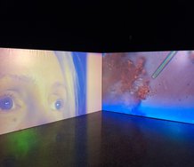
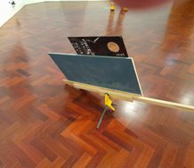
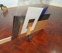
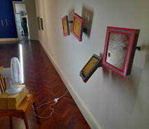
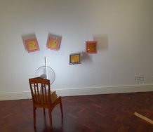
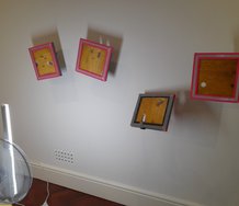
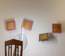
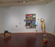
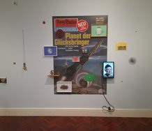
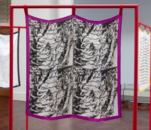
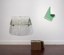
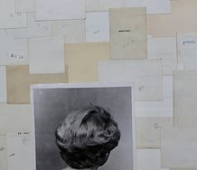
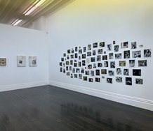
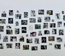
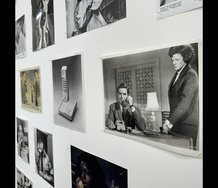
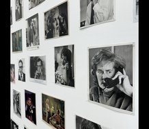
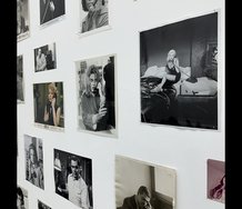
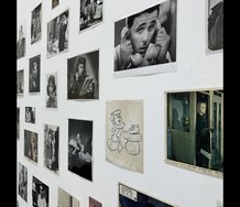
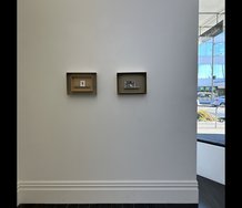
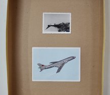
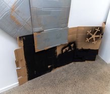
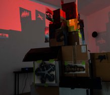
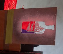
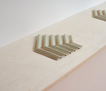
Peter Dornauf wrote about this show a few months ago when it was in Waikato, but knowing that theatre foyer & corridor space, I‘ve always wondered about the installation of Darragh’s recycled PVC movie banners - how they would look on gallery walls (or if they were stretched across space with cords and grommets?). The surface quality of the thin paint and paper collage: what was that like? And the scale? Photos can be so misleading.
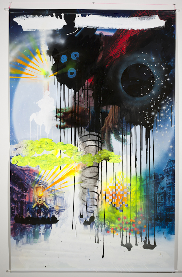
Seeing them firsthand I find myself delighted by their rawness, the roughness of the frenetically brushed on acrylic or long lines of sprayed fluoro, the glee with which she has obliterated the protagonists’ faces and promotional texts - and how the untouched remnants of the original Hollywood imagery gets revitalised by her new gestural and decorative context.
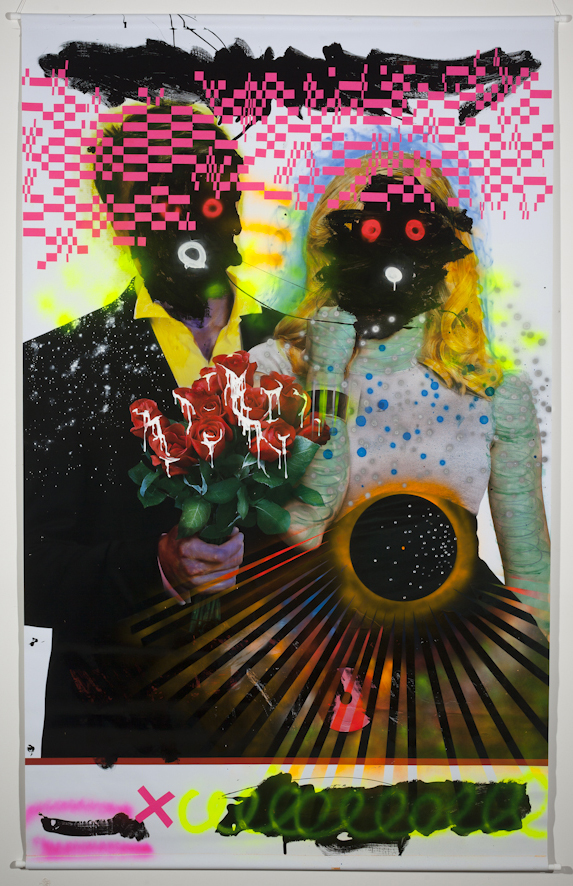
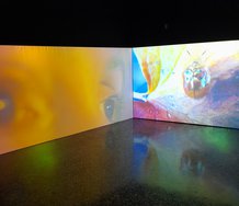
There is something deliciously juvenile, even proudly irresponsible, about the way Darragh has eradicated many of the actors’ heads with squiggles of black paint and then placed glowing doughnuts for eyes and mouth - a detoxified caricature of ‘darkie’ stereotypes. Bridget Riley grid patterns and swirling Larry Poons ovals allude to digital pixilation and spinning mirror balls, while warriors with laser guns and samurai swords reference computer games and paint ball firefights.
I like the way she defaces these (to me - gross) Hollywood advertisements with relish. Her joy in malicious markmaking is akin to graffiti - but not tagging with signs to be recognised as calling cards (though there is a hint of that too - with a typical Darragh ‘fluoro’ palette). Instead she mocks ‘action’ by vandalising the bland conventions of filmic glamour, dismissing apocalyptic spectacles with their gun barrels blazing, by having blood seep out of the ‘heroic’ soldiers’ clenched fingers. Even romantic love gets a scathing rejection, zombied devoted couples clutching roses with spunk oozing out of their red petals. Tasty stuff!
These improvements are not so much narratives about warfare or technology of the future, but more an exuberant extolling of the pleasures of applying tactile paint to destroy an image. Inventive eradication. It’s an iconoclastic sensibility praising the pleasures of erasure as a means of making a new sort of icon, the handling of colour as a messy substance from which an artist can also stickily draw out wit, of which there is plenty.
John Hurrell
Recent Comments
Roger Boyce
Anarchic reclamation of public visual space from Hollywood colonizers. I wonder about shelf-life...but for the moment they fit the moment.
 Two Rooms presents a program of residencies and projects
 Advertising in this column
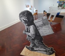


This Discussion has 1 comment.
Comment
Roger Boyce, 9:35 p.m. 8 November, 2012 #
Anarchic reclamation of public visual space from Hollywood colonizers.
I wonder about shelf-life...but for the moment they fit the moment.
Participate
Register to Participate.
Sign in
Sign in to an existing account.