
John Hurrell – 30 July, 2012
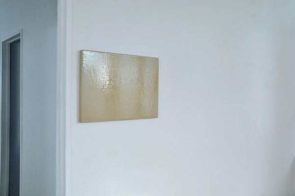
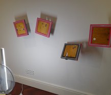
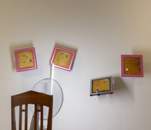
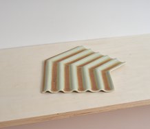
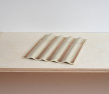
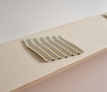
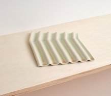
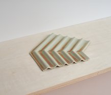
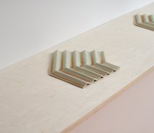
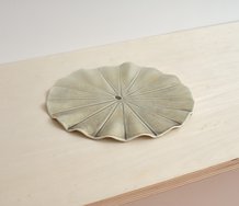
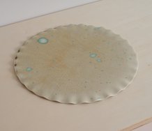
Some storebought canvases (some in linen, another still encased in cellophane) were used to present variations of tan or clay coloured brown, as if rendering a barren existential landscape devoid of meaning. Except these mischievously enforced the standardising of a civic visual ethos in protecting privately owned surfaces. Featuring the blandest of colours, tertiaries that by themselves looked quite inert and drab, these hues extolled the virtues of blocking out.
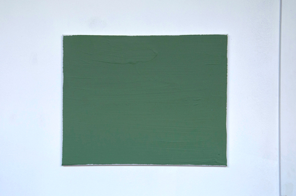
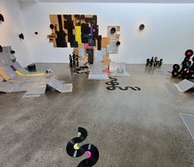
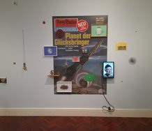
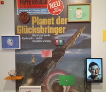
Here we had an unusual painting exhibition that presents rnonochromatic canvases made with anti-tagging substances used by the Auckland Council. They were paintings made with varieties of brown and green paint devised to prevent painting, writing or drawing on public walls (as do certain slippery, friction-free varnishes, or liquid ‘shields’) or obliterate it. The show’s title expressed the artist’s amusement in using anti-graffiti ‘weapons’ to mock futile ACC attempts at graffiti control. Brown of course is also the name of the mayor.
Some storebought canvases (some in linen, another still encased in cellophane) were used to present variations of tan and clay coloured brown, as if rendering a barren existential landscape devoid of meaning. Except these mischievously enforced the standardising of a civic visual ethos in protecting privately owned surfaces. Featuring the blandest of colours, tertiaries that by themselves looked quite inert and drab, these hues extolled the virtues of blocking out.
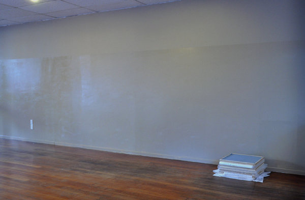
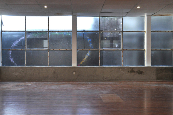
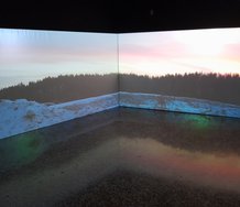
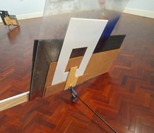
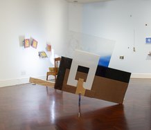
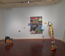
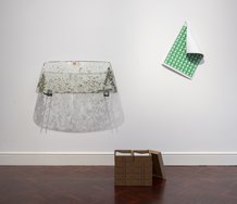
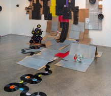
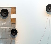
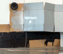
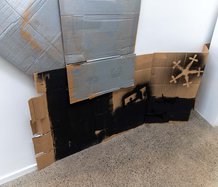
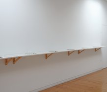
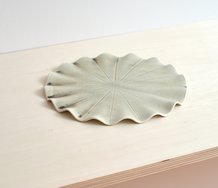
Two other canvases, left in position from a previous Snake Pit group show, were painted by invited council painters. Another monochromatic work, a mural, used ‘clay brown’ acrylic and uracryl shield to cover a long wall, and another work still removed a wall’s inner lining to expose a block of windows, some of which were covered in perforated bus vinyl and under a drawn-on loop of glued glitter through which you gazed at nearby dilapidated inner city buildings.
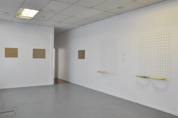
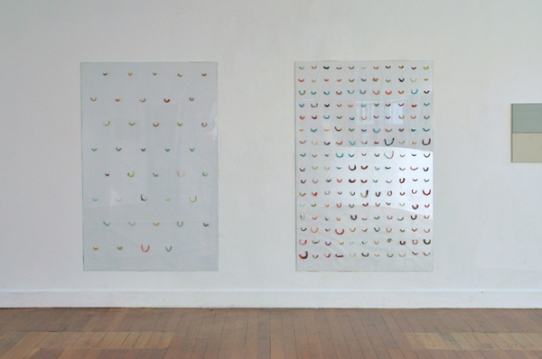
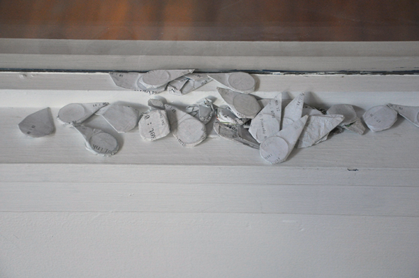
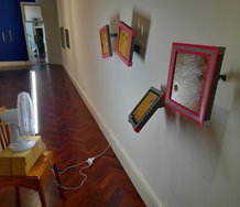
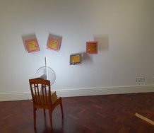
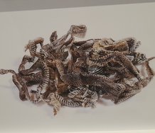
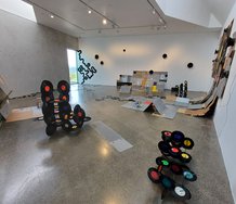
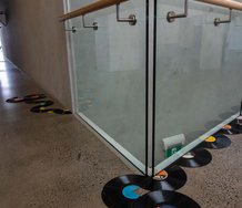
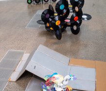
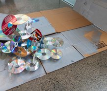
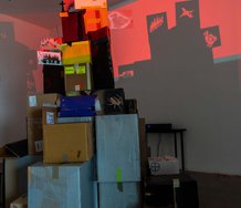
A couple of other related relief sculpture projects on walls were round the corner. One involved members of the public chewing donated packets of fruit flavoured gum and blending different colours in chomped up strips to make smiley mouths stuck in horizontal rows on large sheets of Perspex - a reference to the perception of chewing gum found embedded in footpaths and downtown walls as a public nuisance.
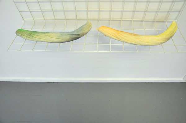
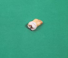
Another continued the oral fixation of the gum, featuring fake bread (thin cucumberlike baguettes) made from aerosol foam and sprayed with bright colours, lying on shelves and sections of wire mesh. It suggested the value of a diet of spontaneous curved lines in the civic space, the role of spray-painted decoration on urban architecture and planning - symbolised here by the wire grid.
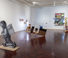
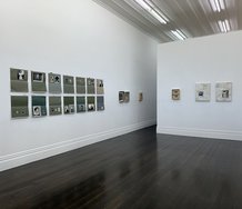
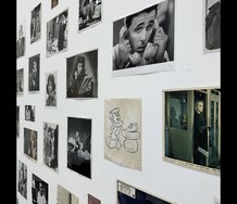
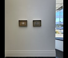
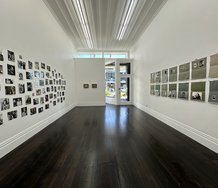
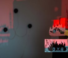
The fourteen paintings here were spread apart to occupy three rooms. It is a clever idea to made paintings with a substance used to destroy unwanted artwork and which is deliberately bland, if not for many, also repulsive or depressing. If you owned one I think you might tire of the perverse humour pretty quickly, though as monochromes go (the tradition they connect with) they are dripping with irony as a celebration of totalitarian obliteration - linked with say the domination of International Modernism in the 1970s. Clever layering - so to speak.
John Hurrell
 Two Rooms presents a program of residencies and projects
 Advertising in this column
This Discussion has 0 comments.
Comment
Participate
Register to Participate.
Sign in
Sign in to an existing account.