
John Hurrell – 20 March, 2012
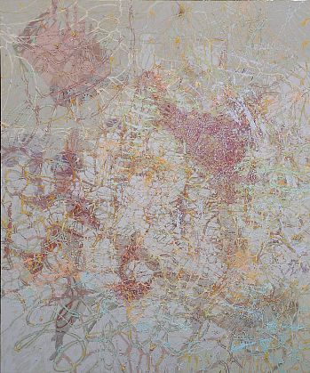
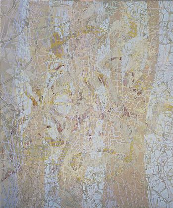
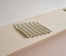
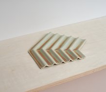
The best paintings are where there is a sense of controlled spatial depth, achieved either by a dark tone dominating one corner or where the painted loops vary less and systematically diminish in size. Or where pronounced emphasis is given some spirals because Thomas has delineated their parallel curved edges with dark paint leaving a paler tone in the middle. They catch your eye and provide a kind of anchor that lets you refocus on the compositional alignment.
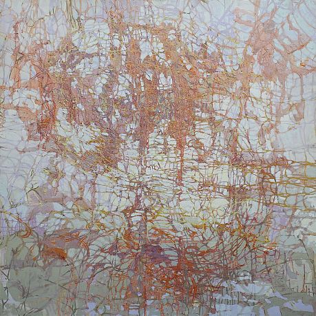
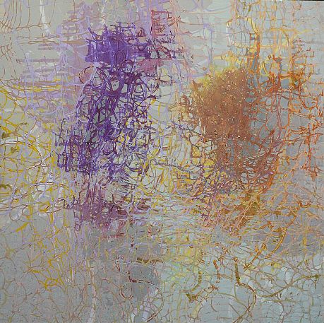
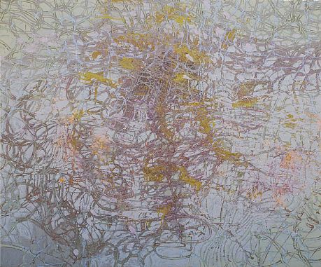
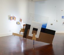
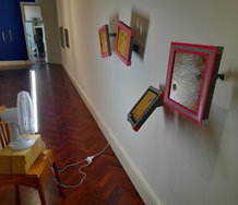
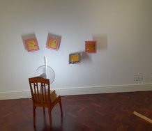
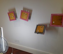
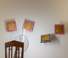
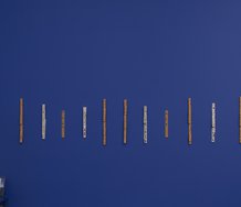
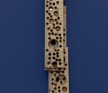
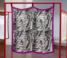
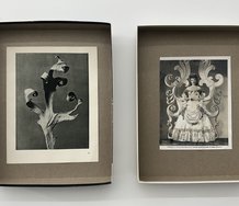
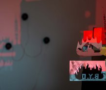
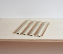
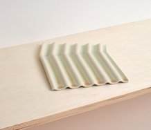
These oil abstractions by Katie Thomas - with their entangled delicate marks suggesting entangled overlaid netting, tumbling ringlets, clusters of leaves, or stretched out, loose knitting - have been shown several times in group shows at Bath St. and are quite unusual. As images they are difficult to photograph. The dominant colour is a mauvy grey, muddy but silvery pastel tones - with ochry lichen encrusted patches intermittently thrown in, and dark underpainting peeking through the web of linear gaps like batik. The surface is obsessively worked, sometimes gritty or lumpy close up, with the emphasis of process and additive processes. Often the oil paint glitters and sections look translucent and waxy as if encaustic.
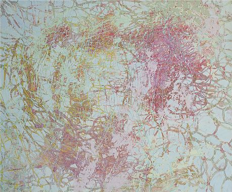
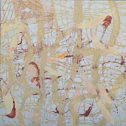
The most recent works are less (early) Guston-like with their daubed stabbed greyish fields, being less complex and more literal with their masked out imagery of falling leaves and thick tree trunks. These to me are a step backwards, being too illustrative, literal and sweet. I prefer the open ended vertiginous paintings where the painting/object seems to have clay or lichen on its surface and Thomas’ spiralling markmaking has stopped arbitrarily, as if she simply ran out of money to buy paint or just got bored. They are compulsively over-worked but strangely that succeeds - especially where in contrast we also see large sections of the canvas weave peeking through, caused by the covering paint being left very thin.
The best paintings are where there is a sense of controlled spatial depth, achieved either by a dark tone dominating one corner (as in Into the Quiet) or where the painted loops vary less and systematically diminish in size. Or where pronounced emphasis is given some spirals because Thomas has delineated their parallel curved edges with dark paint leaving a paler tone in the middle. They catch your eye and haul you in through the confusing jumble by providing a kind of anchor that lets you refocus on the compositional alignment.
Thomas‘ pale paintings are firmly based in nature and foliage as much as knitting. They are related to Twombly but devoid of scatological references, being more connected to traditional landscape drawing - and there is no sense of handwriting or ordered calligraphic scribble (or unravelling wire) as in Darboven. (Nor are the lines elegantly spread apart like Marden or Thornley.)
I think the work would succeed more if the stretchers were a lot bigger and the viewer allowed to be physically overwhelmed by the rendered layers of ‘netting’. The marks are in a tradition of horticultural drawing but as she is using tonally consistent paint (not crayon, pencil, charcoal or pastel) that oily substance blurs the graphic dynamic so that the soft surface becomes almost literally clay. Such a sticky and earthy malleability seems intended to distance the marks from the synthetic or industrial, and would be further boosted by a more strident theatricality.
John Hurrell
 Two Rooms presents a program of residencies and projects
 Advertising in this column
This Discussion has 0 comments.
Comment
Participate
Register to Participate.
Sign in
Sign in to an existing account.