
Creon Upton – 24 November, 2011
It seems to me something of a shame that - somehow, somehow - art has gotten all mixed up and confused with cool. It's why romanticism has had to be hiffed into the sea. Without repeated injunctions against it, artistic young men would be endlessly losing their cool through their innate addiction to romance.
Christchurch
Sebastian Warne
A Funeral I’d Fly To From Anywhere
10 November 2011 - 26 November 2011
If there is a theme or tendency to be discerned in the shows that ABC has put on since it opened earlier this year, it seems to me that it’s a kind of evasive, anti-heroic resistance to the world’s expectations. It’s something frustratingly passive and pliant that at the same time holds its own by shrugging out of your way and settling again on a nearby stool, gazing wide-eyed and impassive back at you.
I think I’d describe it as little-girl art - work whose only agency lies in your inability to quite convince it to do or to be anything in particular. If there’s anything gratifying about this - and frankly I’m holding to my ambivalence - it’s the seemingly complete banishment of romanticism from the scene. Even that banishment doesn’t feel romantic - and that is certainly an achievement of sorts.
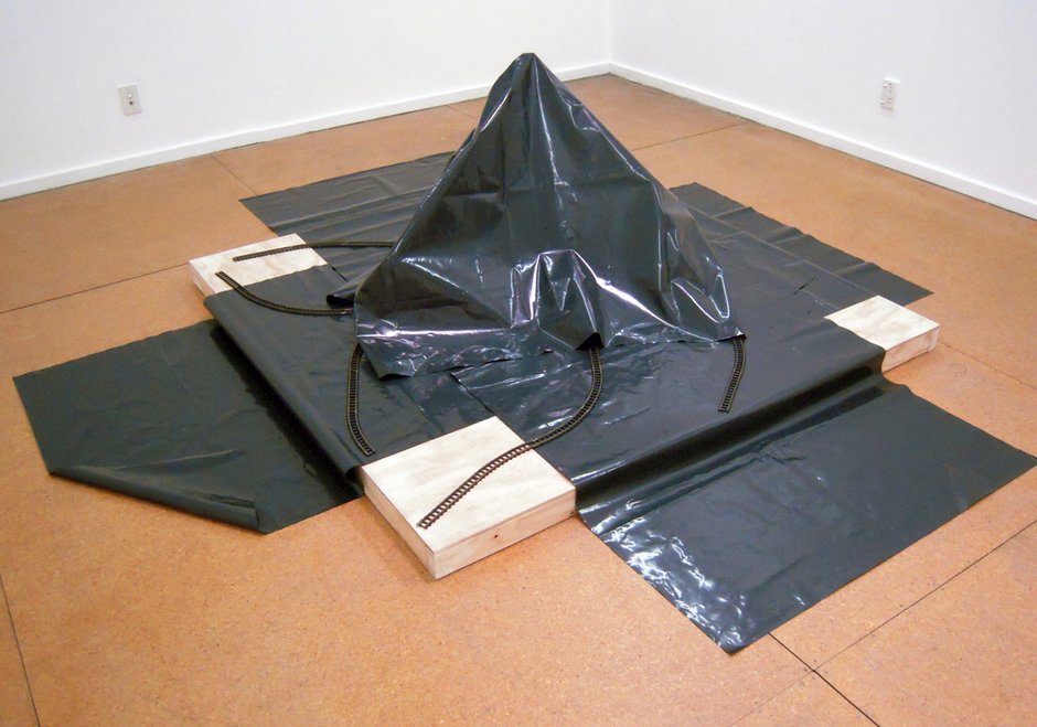
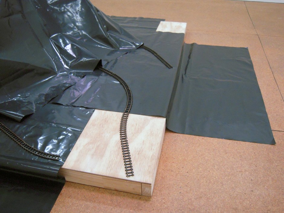
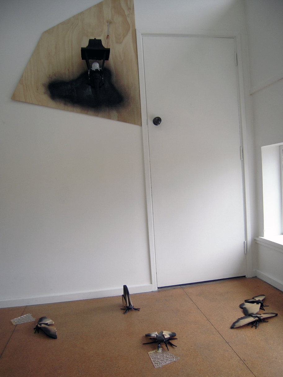
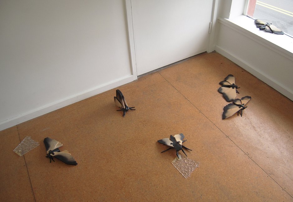
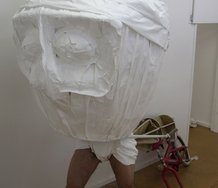
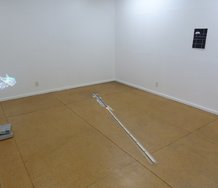
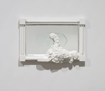
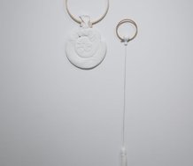
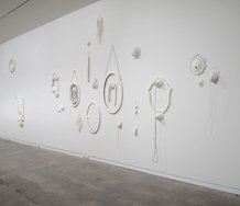
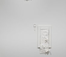
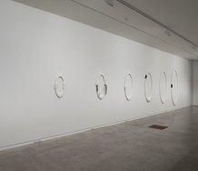
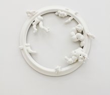
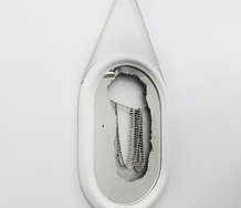
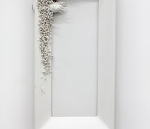
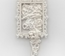
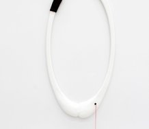
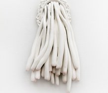
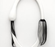
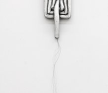
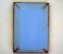
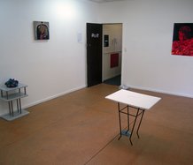
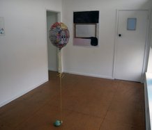
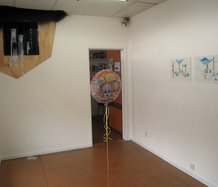
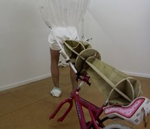
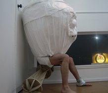
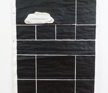
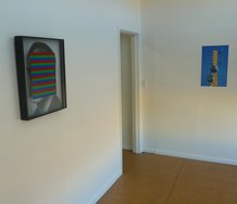
This show of Sebastian Warne’s fits right into the mould. It consists of not much more than plywood and polythene, spray-paint and hot-glue, a photograph and a lantern. There are four pieces - three sculptures and the photograph - and while there’s a hint or two of conversation between them, it’s muted, almost dumb. In fact, these hints at conversation are more like grunts or farts: they are demonstrative while simultaneously suggesting that they possibly amount to nothing at all beyond the most simplistic denotation you care to imagine.
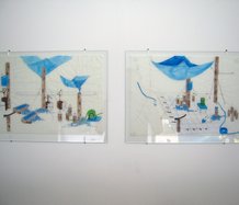
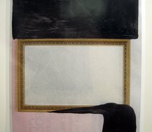
Train tracks, for instance, feature in the photograph (I followed her to the station (the blue light was my mind)) and in one of the sculptures (A play without a plot (plastic bore-hole)). Both are landscapes, one depicting Monument Valley, the other a little more ambiguous. In the photograph, there’s a crudely staged train-wreck; in the sculpture, the tracks lead nowhere.
Is this all some kind of - you know - “comment”? Some reflection on the post-industrial world? Surely that’s too obvious. But if not that, then what?
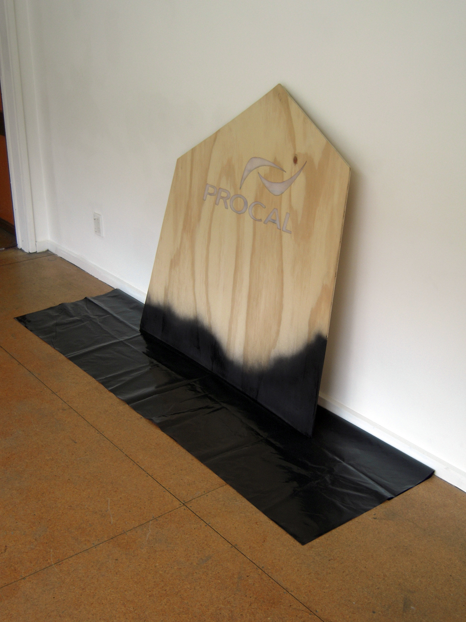
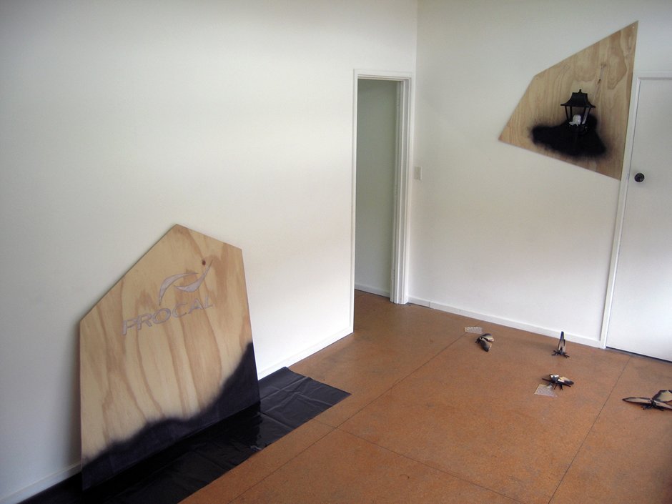
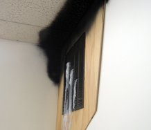
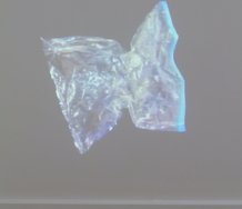
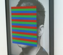
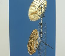
Similarly, the two remaining works also suggest correspondences. Watch you exhaustion (Landscape billboard) crudely reproduces some corporate logo, while I’m up in the woods, I’m down on my mind (for Eckart Voland) depicts moths in a state of existential confusion after the death of their wall-mounted lantern.
Again, is there a comment here on the modern man’s malaise and his pathetic product-dependence? Or is that simply too trite?
On the one hand, the works refuse the obvious; on the other, that’s all there is to them.
Certainly, it seems unavoidable that the show expresses some fundamental dissatisfaction with the world we have inherited, but it doesn’t go beyond the banal and it refuses to explore this in any serious way, almost like it’s entirely unaware of itself, like the right arm really can’t see what the left is doing, like the artist really believes that he’s creating nothing at all.
It seems to me something of a shame that - somehow, somehow - art has gotten all mixed up and confused with cool. It’s why romanticism has had to be hiffed into the sea. Without repeated injunctions against it, artistic young men would be endlessly losing their cool through their innate addiction to romance. Cool is all about never committing to anything and passing that off smirkingly as insight and understanding while your friends all smirk on in paranoid agreement.
The work that ABC tends to show - Warne’s included - is not I think, or not entirely, messed up in such tediousness, but it is perhaps slightly infected by it as it gropes its way towards meaningfulness. The stark and basic and ugly materials represent a coolness that I can respect. They even seem ethical. I have less time for the disavowal of intention and care, for the artist-subject’s walking away from thoughtfulness out of seeming embarrassment at where it might end up or what it might say.
That embarrassment - or unconcern, or boredom, or whatever it is - could itself serve as the basis of some interesting exploration.
I don’t see ideas in art as anything different from, say, paint in art. Ideas are there to be pushed around, mixed up, forced into arrangements that surprise us by articulating unspeakable intuitions. That may be a romantic conception, but it is also one that only a false consciousness would entirely disavow. And an idea that just sits there like a fat cow in the road requires elaborate sideshows to make it appear interesting.
It is curious to look at these 2011 works and sense a lifeblood in the postmodern sensibility, something that never really seemed set to last, aesthetically speaking at least. It’s there in the blankness and simplicity and refusal of Warne’s physical and ideological materials.
I don’t condemn Warne’s work - firstly because it’s not my place to, and secondly because I find a sincerity there that attracts me. But it is a sincerity that is unsure on its feet, that drifts unfocused, that is prone to distraction and disbelief.
Its own sincerity may comprise an artwork’s primary subject.
Creon Upton
Recent Comments
Creon Upton
Yes. I think there's a whole lot in what you say Roger. It's interesting, and I'm pleased someone's taken what ...
Roger Boyce
The “cool”, the non-committal cool, you chase-up in your review of Warne’s exhibition is in most cases, I suspect, a ...
Roger Boyce
Mr. Upton. Your review of Sebastian Warne reminds me that I’d been wrestling with the whys and wherefores of the ...
 Advertising in this column
 Two Rooms presents a program of residencies and projects
This Discussion has 3 comments.
Comment
Roger Boyce, 10:58 p.m. 24 November, 2011 #
Mr. Upton. Your review of Sebastian Warne reminds me that I’d been wrestling with the whys and wherefores of the young folks’ - now-seemingly-perennial – utilization of dumbness-as-defining-strategy. Dumb, that is, as in the archaic (and socially suspect) disability descriptor … ‘deaf and dumb.’
Being sensitive to the role vintage plays in understanding (or misunderstanding) creative developments - developments well past my own particular ripening - I was pretty sure that, while pondering dumbness, I’d not be graced with any revelatory cloud-parting, as to the whys. But would instead need rely on simple trudging, short of a lucky break.
One day while walking through the studios, where I work, I had a modest but (at least for me) indisputable epiphany about the puzzling matter of dumbness. What came in that moment suggested to me that - somewhere in the Augean stables of the subconscious – I was done shovelling and that the kids’ dumbness ‘code’ had been broken by invisible (but dogged) deep-space spadework rather than luck.
Young folk, having had (for countless generations) their golden demographic - and its creative output - mercilessly mined, for signs and portents (by marketeers, ad-men, art directors, stylists, fashion designers, gun-for-hire futurists and trend prognosticators) grew collectively wary and gun-shy. And in their shyness have begun to play dumb. To play dead. Thinking, perhaps, if the work’s breath was shallow enough that circling predators would mistake stillness for death and cease worrying a seemingly lifeless carcass.
For (outdated) example, when the creative wetlands of Soho, 57th Street and later Chelsea meant anything, on any given day, one could see creative salary-slaves drifting (like jellyfish-riding-the-latest-currents) through dealer galleries, alternative spaces and contemporary museums …. absorbing fresh, nutritious substance and style. Last (or even this) season’s hip-signifiers soon found themselves digested and shat into/onto layouts…and shot through product and the fabric of fashion.
Little to nothing depicted, said, sung, played, danced or acted was outré enough, obtuse enough, rough enough, grotesque enough … to kill the appetite of the (legion) hungry ghosts. Nothing was so pungent, or for that matter, bland and calorie free, as to put the cradle-robbing ghouls of media and product placement, off their feed.
I think young folk, having (instinctually) had enough of being eaten - weary of being followed about and tired of being mercilessly mooched off by an evermore efficient commercial culture - decided (or the zeitgeist decided for them) to play possum. Well, not wholly possum. I reckon there’s a bit of fox in the mix there as well.
(continued)
Roger Boyce, 10:59 p.m. 24 November, 2011 #
The “cool”, the non-committal cool, you chase-up in your review of Warne’s exhibition is in most cases, I suspect, a false-scent-trail. The sort of instinctual misdirection I’ve sensed in a lot of work of what I’ll call the ‘dumb’ (for wont of a better term) category. You / I, even the canniest viewer, will fallibly follow a pungent trail redolent of meaning – but, as we’re looking for, speculating about, predicating content on what we think we’ve sniffed out, the artist is doubling back, lying back down, or, better yet, getting back down to the serious business of seeming to be “- creating nothing at all.” To be saying nothing much in particular. Refusing to speak. At least refusing to speak sensibly.
I thought it wonderfully risky, and obliquely accurate, of you to observe that work such as Warne’s (and some of his fellow ABCers) appears to be “- shrugging out of your way and settling again on a nearby stool, gazing wide-eyed and impassive back at you.” To go so far out on a limb as to describe the character of such work “- as little-girl art - work whose only agency lies in your inability to quite convince it to do or to be anything in particular. “ is to understand or at least allude to fact that a young child’s impassivity (or passivity) in the face of adult demands and/or expectations (much as temporally irrelevant expectations and demands pester ,and attempt to draw out, generationally defined artworks) is - although viewed as infantile, through a cloudy lens of age – in fact r-e-s-i-s-t-e-n-c-e (by the child or the work) to agendas and agencies extrinsic (and doubtless antithetical) to itself. As you may know, I‘m raising an almost six-year-old kid and can attest to the referential accuracy of your illustrative analogue.
And, although I think I’ve made little graspable sense here.….here’s looking at you, kids.
Creon Upton, 1:36 p.m. 25 November, 2011 #
Yes. I think there's a whole lot in what you say Roger. It's interesting, and I'm pleased someone's taken what I've said and moved it somewhere. Thanks.
Participate
Register to Participate.
Sign in
Sign in to an existing account.