David Cross – 30 August, 2011
As I moved through the pavilion, I began to lose sight of the powerful initial resonances and felt bogged down by too many different layers of meaning. The majority of these big ideas were clearly and crisply articulated in the carved Steinway and its live performance.
Venice
Michael Parekowhai
On First Looking into Chapman’s Homer
4 June - 27 November 2011
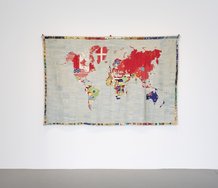
By Parekowhai standards the banner on the palazzo was fairly demure but it still warranted a smile. Thousands of people going past on vaporetto, water taxi or tourist trap gondolas, would have planted the name somewhere in the back of their minds as they sped or crawled past the elegant palazzo building in Dorsoduro. Michael Parekowhai might not have had brand recognition on the grand canal but the combination of his name, the enigmatic title On Looking Into Chapman’s Homer, and New Zealand pavilion would have functioned as a teaser for the adventurous to make the pilgrimage to the other, less art saturated, side of Venice.
Every detail helps when you are out in the Venice Biennale boondocks, and the banner, in tandem with ingenious ground sticker signage placement, made it as easy as possible to navigate the rabbit warren of twists and turns to actually get to the pavilion on foot. I was pre-warned to listen for the music and sure enough after what felt like a dozen right hand turns, there it was, a combination of Venetian soundtrack functioning at the same time as an aural NAVMAN device.
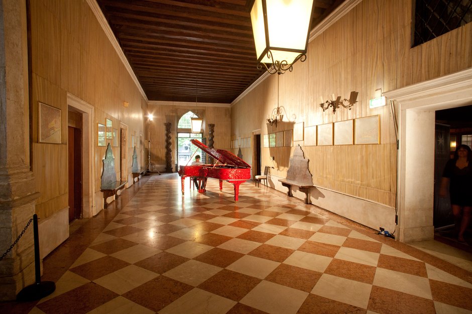
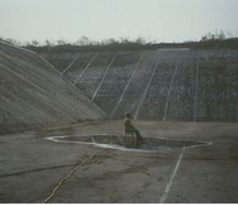
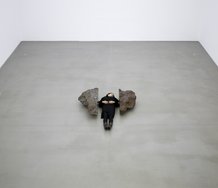
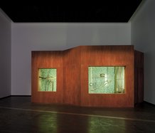
The palazzo entrance from the water is certainly grand but on foot you enter via a very modest side door. This architectural quirk is hugely advantageous however, for the small entranceway does not in any way prepare you for the amazing gestalt encountered on stepping out into the main space. With its full acoustic power resonating off the cavernous walls, a red and intricately carved Steinway sits in the middle of the space played by a young Italian classical pianist. As art moments go it is a big one: vibrant colour; monumental form; crisp melodic sound, and the requisite semiotic registers of colonial and postcolonial meaning rubbing against each other. Bread and butter Parekowhai and done with great care and consideration for the building, the Venetia context and the audiences navigation of the space.
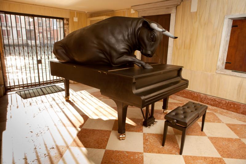
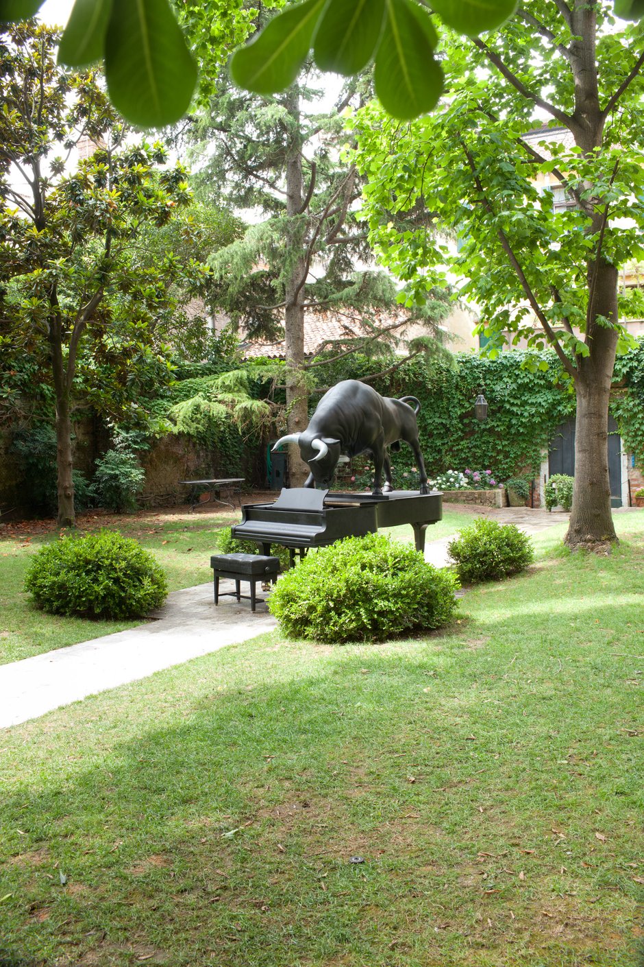
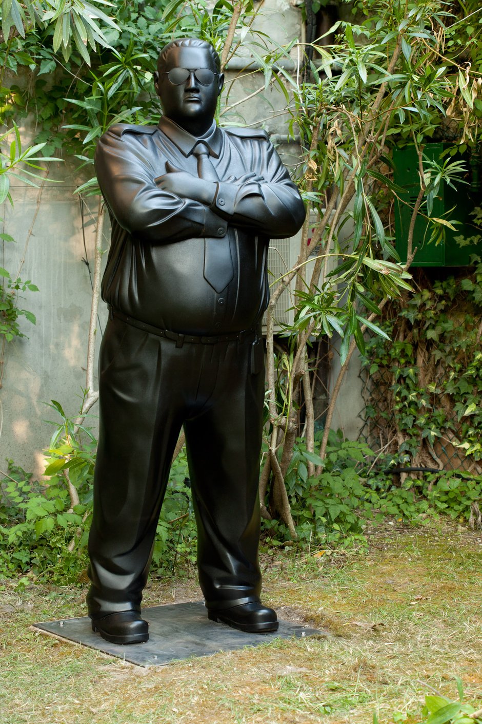
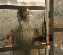
If we could leave it there - just piano, live performer and space - it would have been a hugely compelling work. But this is Venice and the uniquely Venetian temptation to meddle with the less is more rule book shows that Parekowhai was not convinced that these components alone were enough in themselves. Like so many artists, he has had that Faustian arm-wrestle with that beast known as ‘economy of means’ and decided that in addition to the piano, the work needed among other elements two more pianos with bulls on top, a number of bronze olive saplings and his well known security guard keeping an eye on things in the rear garden. As I moved through the pavilion, I began to lose sight of the powerful initial resonances and felt bogged down by too many different layers of meaning. Without doubt each component spoke to highly specific aspects of the exhibition schema, to the complex layering of cultural interchange between New Zealand and Europe, the grand and popular history of sculpture, and to Parekowhai’s highly specific bi-cultural reference points, but the majority of these big ideas were clearly and crisply articulated in the carved Steinway and its live performance.
Yes, the specificity of the different components added extra and no doubt important layers of meaning. The security guard offered that requisite Kiwi sense of humour, making sure no one thought about climbing on the pianos, or especially nicking the goods entirely. The olive saplings spoke of transplantation and, as Greg Burke outlines in his catalogue essay, the mores of the world of Homer. But in loading up the reference points to full throttle, I was struggling to keep hold of the elegant bigger picture so well framed in the initial experience of the work.
Keep in mind that this response comes from having already seen probably 100 different artworks that day which is part and parcel of the Venice context for most visitors. Without wanting to argue for art as a one-liner or an easily absorbable experience, the saturation effect of so much work has a major impact on not only what we choose to see but also the faculties we bring to bear on meaningfully engaging with it. Maybe if I saw it first thing in the morning with a clearer head it might have been different, but I am not entirely convinced this is so.
Parekowhai was probably overdue in getting the Venice Guernsey and the key component of the project was to my mind a career highlight. It is never easy to rise to the challenge of Venice with its insane range of constraints and challenges, but he delivered and the work stood up in excellent company. But in clinging onto that potentially hackneyed, yet genuine, belief in keeping things to the point (or at least not adding unnecessary eggs to the pudding) in Venice, its hard not to wonder whether slimming down the shipping crates would have pushed the work into another register altogether.
David Cross
 Advertising in this column
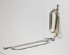 Two Rooms presents a program of residencies and projects

This Discussion has 0 comments.
Comment
Participate
Register to Participate.
Sign in
Sign in to an existing account.