

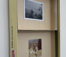
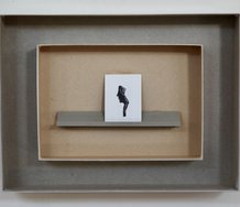
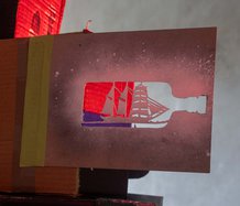
![Elliot Collins, The Spirit of the Letter (Manet #1, Portrait of Emile Zola [detail]), 2011, found book, gesso, paper, doming resin on hardboard, 490 x 430 mm / 400 x 300 mm](/media/thumbs/uploads/2011_06/ElliotCollins_TheSpiritOfTheLetter_2011_TimMelvilleGallery_jpg_940x2000_q85.jpg)
John Hurrell – 2 June, 2011
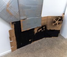
With their backgrounds of hot lines of colour and odd letter treatment these paintings suffer from overkill, of trying too hard to be clever - as if art was really about mental dexterity, though it is about thinking. Some works seem to be overthought, though the problem remains of how can you tell that visually? They just seem laboured and ideationally convoluted.
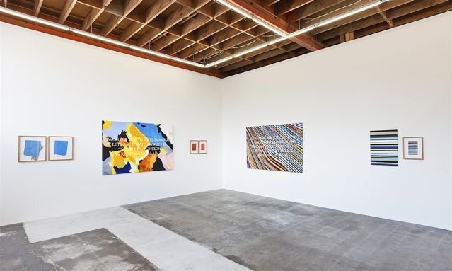
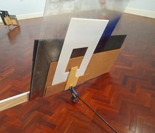
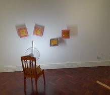
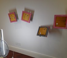
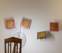
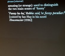
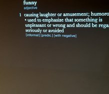
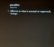
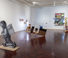
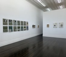
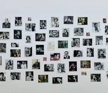
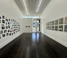
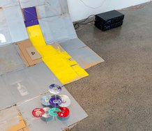
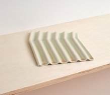
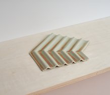
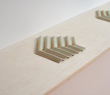
Standing in front of some strange object hanging on a wall, one often wonders what is it there for. The well known art historian James Elkins once wrote a book asking ‘Why are our pictures puzzles?’ and that is an accurate summation of the values of this exhibition by Elliot Collins. Except these are not the usual single panel paintings - they are far more complex. Sometimes in two parts, occasionally three (usually on paper and framed under glass), very rarely four.
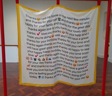
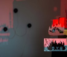
The works are sort of obscure rebuses, mostly connected in some way with language and found books, many of the latter being invariably included. Of the sixteen artworks three are canvases with paragraphs of text placed over colourful abstracted landscapes. Their words are enigmatically coded, either spelt phonetically, or with some of the seriffed font letters flipped over in reverse.
One wonders if words in direct English, simple fonts and plain backgrounds would by themselves convey the sentiments and richness of the writer’s imaginative intent better. With their backgrounds of hot lines of colour and odd letter treatment these paintings suffer from overkill, of trying too hard to be clever - as if art was really about mental dexterity, though it is about thinking. Some works seem to be overthought, though the problem remains of how can youtell that visually? They just seem laboured and ideationally convoluted.
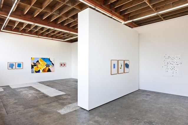
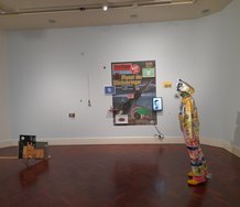
The real thinking, for the viewer, probably comes if they borrow or buy a work and spend serious time with it, relaxed in their own environment. Looking at the show in Melville’s space the works that draw me in are visually simple, with semantic nuances and inter-part relationships that might open up over time.
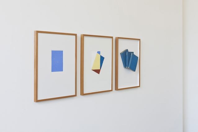
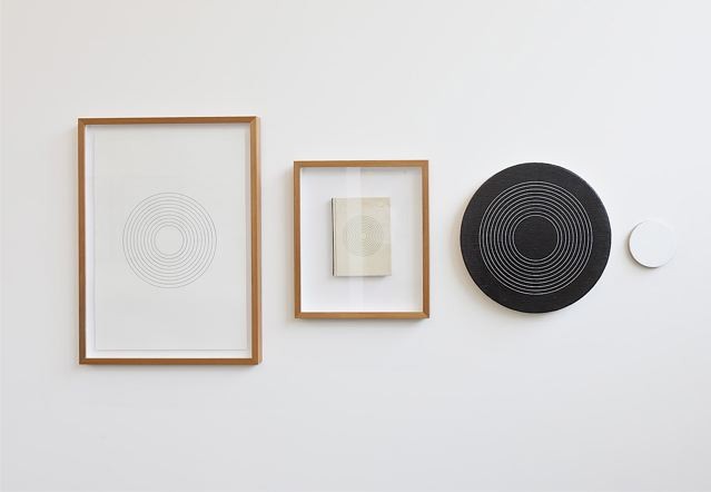
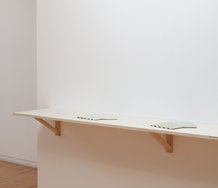
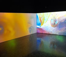
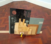
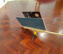
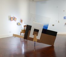
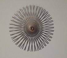
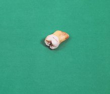
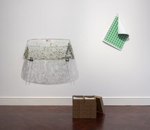
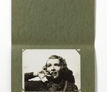
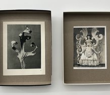
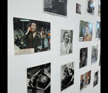
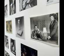
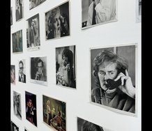
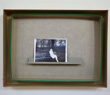
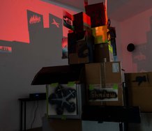
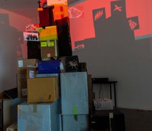
For example, The Adventure presents a glued stack of three overlapping books (all The Aesthetic Adventure) that have rectangular parallels with two paintings on paper on their left and relate to the content of the book title. Another, The Spirit of the Letter (Manet #1, Portrait of Emile Zola [detail]) is calculatedly ambiguous, the spirit being of lettering in painting or the conventional coding or intentions of painting. The incorporated nearby painting with scattered diamondlike metallic flecks is also spatially and optically unstable.
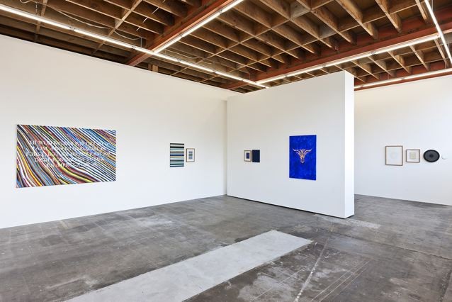
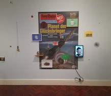
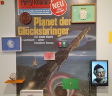
A third work, The Theory, seems to be about the avant garde and how ideas get recycled. The motif of concentric circles is repeated four times, implying that artistic innovation is not possible. The same motif also stands for a time tunnel that art practices keep moving through, suggesting maybe that experimental radicality is part of art history after all.
This is a varied show with a title that comes from Italo Calvino’s Invisible Cities. From the work you pick out what you want and ignore the rest. It mixes irritating, over contrived raucous works with delicate understated ones that slowly creep up on you. It has a double sensibility, oscillating between two extremes.
John Hurrell
 Advertising in this column
 Two Rooms presents a program of residencies and projects
This Discussion has 0 comments.
Comment
Participate
Register to Participate.
Sign in
Sign in to an existing account.